GameArt Spotlight #18
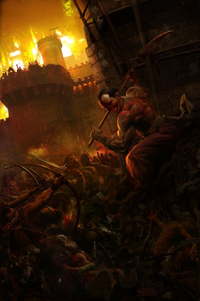
"Soulblighter" by Craig Mullins
Image details
- Title: Soulblighter
- Gallery ID: 00562
- Artist name: Craig Mullins
- Posting date: 1999-04-30 (a Friday)
- Artist website: http://home1.gte.net/craigm/index.html
- Tags: myth, paintings, drawings, fire, castles, barbarians, medieval, archers, swords
- Image size: 37.56 KB
- Votes: 63
Please be sure to read the Copyright & Legal information text on the About & Help page.
Spotlight article
The style of the art and design of Myth 2 are based a genre of fantasy art that was first created by Frank Frazetta back in the 50's and 60's. He has influenced many artists over the years. Frazetta started as a comic book artist and worked in black and white. You can see how Frazetta's painting style was influenced by the comic style, just black and white with no gray. There is usually one light source and the shadowed sides of forms are flat. No fill light or secondary light sources or ambient fill. It is very dramatic and the resulting 2-d shapes are very strong and well designed, again, like good comic art. Many times the boundaries of objects are lost as they overlap and create one big shape. I try to work without "losing" areas in shadow- there is always some texture and detail. I hope it resembles good photography or "well exposed" in other words. But I do lose some of the strong shape design, and that can lessen the graphic impact of an image. My challenge here was to make an image that alludes to Frazetta's style without duplicating it.
The first image shows how I start blobbing paint around and see if anything emerges. You really have to have an open mind and not worry if this takes awhile. You can start with a very low rez file at first, even a couple of hundred pixels. Once your composition is set, then you can resample as high as your hardware allows. Since there are no details or other specific textures or edges, resampling does not lessen quality. I like to work at 3000-5000 pixels.
I imagine most people are more comfortable starting with line, since line is what they usually start with. I like to start with solid areas of value and color. Most linear styles use a line to delineate the edge or silhouette of a form, so why not use a block of value to do the same thing? Maxfield Parrish, a great illustrator, could not draw a figure without doing a paper cutout first. We all have our neurosesÖ I like to combine shape, color and value at first, as opposed to separating them. It can be more complex, but when you are squibbing around with paint looking for something, it can help something emerge that might not have otherwise.
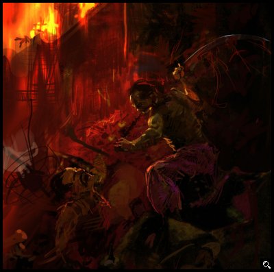
It is important to get rid of the white of the "paper" right away, so you can start comparing values. I like to work from a middle value to lighter and darker. You might even fill the gray with a texture, creating something like Canson paper. Stretch it, invert it, run a filter, flip it, whatever. It is so easy to do digitally that it doesnít make sense to not play with it. The best thing about digital painting is that no change is permanent, and you can go back to any stage at any time. Also, there is no "media buildup," i.e. in traditional media things can get thick or abused very quickly. You can paint endlessly, and on floating layers. If you are a traditional artist, learn to take full advantage of this.
The three versions you see here are a good representation of the stages a painting goes through. As you can see, things can change quite a bit, either from client input or your own ideas. One good trick is to flip the image. You will see it "for the first time" all over again.
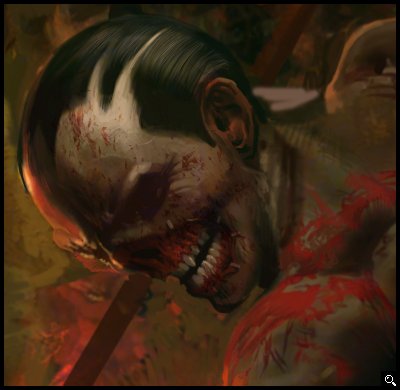
When you can see something emerge, slowly begin refining. Many times it helps to use an adjustment layer and take the contrast out of the image to create area of activity contrasting to one of flatness. Take the contrast down on the whole image, and painting on the mask, bring back selected areas that will be lighter. Think in terms of big shapes, the overall design of light and dark. Don't get bogged down in detail at the beginning. When I was a kid I would start at the upper right hand corner of a picture and paint it finished all the way down and across. It was difficult to break that habit, to try to think simply and broadly at the beginning. If you don't, the image will not be well "designed," and whatever care in the finish and fine rendering you put into it will not be to the greatest advantage. You have seen art that looks photographic, but was somehow missing something? The art lives in the big shapes. Sometimes simplifying makes things much better. Can you increase the contrast of an image until it is just black and white and have it still look good?
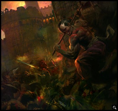
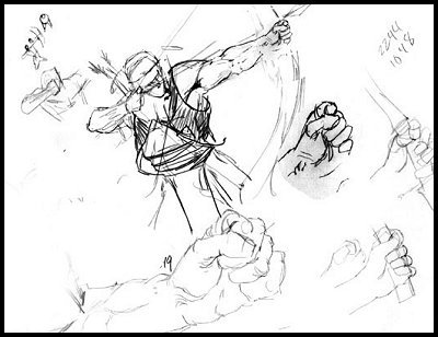
If you are having problems with something specific, Is the structure (drawing) correct? Lay some section lines out if you are not clear. You have to have a clear mental picture of what your forms are. If they are correct, do the values describe them? Analyze the direction of light and what your values are describing. Play with color only after structure and value are correct. Convert a copy of your painting to HSB and look at the B channel. It is kind of like troubleshooting a computer- isolate the variables until the problem is identified. The archer on the left was giving me trouble, so I did a drawing on paper and worked it out that way.
Text written by Craig Mullins for GameArt.com


