

GameArt Spotlight #25
"Loonyboi's Revenge" by Sumaleth

Image details
- Title: Loonyboi's Revenge
- Gallery ID: 00603
- Artist name: Sumaleth
- Posting date: 1999-06-17 (a Thursday)
- Artist website: http://impact.frag.com
- Tags: Kingpin, Quake3, q3a, Messiah, Giants, The, Phantom, menace, hill, notebook
- Image size: 39.46 KB
- Votes: 24
Please be sure to read the Copyright & Legal information text on the About & Help page.
Spotlight article
Loonyboi's Revenge was painted as the cover for the second part of E3 (Electronic Entertainment Expo) coverage on Loonygames (issue 1.39), following up from the first part the issue before. For part one I had done a scene with Loonyboi (Loonygames editor) and one of the other contributors surrounded by a menacing array of game characters, and so with the second part I was looking for a continuation of the theme.
This is actually the second version of the cover that I did; when the issue was delayed I got a chance to scrap the original version (which I really hated..) and start again. The second time I made sure that I had a plan in mind before I started, which was the mistake I made with the first version.
I have a big reference library, so I have plenty of art around to get inspired by. I decided to try something in the style of Frank Frazetta (I'm a big Frazetta fan) so I started looking through his books to see if one of the paintings would spark an idea. I come across a painting, 'Jaguar God II', which did just that; the idea of Loonyboi, with laptop in hand (working on E3 reviews), standing at the apex of a mountain trying to fend off the advance of game characters (who were taking action against possibly nasty reviews.. or something *shrug*).
The way I start off an image is generally the same no matter what style I'm planning to do. I start with a small image - ~100x100 - for the initial testing. The small size lets me worry more about the layout and composition before I get in too deep (that was the big error I made with the original version..). Next I fill the background layer in a mid-value colour (something like a soft pastel blue).
I then make another layer on which I do the initial sketch. I usually use a very small air brush or paint brush at 50% opacity to do the sketch, which I tend to do very roughly in more of a symbolic form than representational (I don't keep much in the way of WIP stages so unfortunately I can't show what it looked like). The sketch to me is more to just get it into the area, and get ideas flowing. I often draw all sorts of swirls and random lines around trying to get a 'feel' for the image, although to someone else it would look like a mess of lines.
If the sketch is too wild, I usually make another layer and then trace a cleaner version over the top. But again, this can often end up pretty rough too since the sketch to me is just a rough guide, the serious fine tuning happens during colouring. With Loonyboi's Revenge (LR), the original sketch was actually very simple; just an outline of the mountain range, and a quick sketch of Loonyboi perched on top (in a fairly similar pose to the one in the reference, although it's quite a different character).
Sketch done, I then go back to the background layer and begin laying in the foundation colours. In the case of LR, I did the sky first, basing it pretty heavily around the sky in the reference image. I then blocked in the mountain colours, and, on a new top layer, I roughed in some basic colours for the character.
All this was to see that the idea was going to work, and by this stage, after about 10 minutes, I was happy with how it looked. So the next step was to scale it up to work size (I deleted the top layer now too because I intended to redo it).
Loonygames covers are generally around the size of 350x350, and I work on a canvas exactly x4 in size (1400x1400). Working at a very large size allows me to be -really- rough with the colouring process, and still get nice results. After more than 10 years doing computer graphics 'pixel by pixel', this new approach is like heaven! It's so incredibly fast compared to the old methods. The other benefit of working larger than the final product is that a "few scribbles", once down at real size, turns into "fine details", so I'm forever just scribbling over areas of the image just to give texture to the flat areas of colour (which is something I don't like seeing). I'm yet to work out how Craig Mullins does that texturing effect..
The reason for working at -exactly- x4 the intended size is that I make use of a nice accidental feature of Photoshop; if you zoom out four times from an image (to 25%), what you see is actually VERY close (virtually identical) to what you get if you scale the image by 25%. This means that I can get a very reliable preview of the image 'at size' just by zooming back 4 times, rather than going through the process of scaling it every time I want to see how it looks. The other similar zoom settings aren't as close to their scaled equivalents (too blurry or too jagged), but x4 just happens to be a perfect match.
This leads onto my work area layout. I give a large portion of the screen to a big zoomed view (I generally work in at 200-800%), and then in the upper/right area of the screen I have a second view open of the same image, zoomed back to 25% (ie. the final equivalent of 1:1). Following? So this means that I can paint all the details in the zoomed view, and instantly see how it looks in it's final 350x350 form. I actually spend far more time looking at the 25% view than the view where I'm painting, so it can often be quite a surprise later when I take a look at the view I've been painting in and see how weird it looks. But so long as it looks right at final size, thats all I'm interested in.
Along the bottom of the work area I have, from left to right; colour sliders (set to HSV mode - this is the only colour selection mode I use), colour pick boxes (I use these 95% of the time, you can get just about any colour you want by layering these), brushes (with a couple of very large custom ones), and finally, options. I have these all separated, rather than in the default single window, because I use them all quite regularly and so it's significantly faster this way. Over the right, under the 25% view, I have the tool bar and the layer window. The layout tends to change from time to time, but I find this variation nice to work with.
Now up at full size, I went back to the background layer and did some more refined work on it. I (finally) managed to get pressure sensitivity working on my tablet only a week before starting this image so this was the first time I'd had a chance to use that feature in an image (I couldn't do without it now..), but it meant changing my colouring method once again (I seem to change it each time I do a new image..). I used the air-brush extensively, using the flat brush type rather than the soft one, set to about 50% opacity. I started with very large brushes, and swirled them around, changing colours from time to time. Then I went to a half-size brush, and added a bit more detail (and smoothed out some of the problems remaining from the large brush), and then finally to a small brush to add the smaller details. The sky took about 3 minutes.
Then I painted in some initial colours for the mountain top. The original intent was to have the top of the mountain quite dark/contrasty, and the bottom more foggy, so I used a large brush and put in some colours to suggest this. I didn't put in any details at this stage since I knew adding the game characters would change the way the mountain needed to be done, so it was left pretty simple.
With the basic 'underpainting' done, the next step I did was to create a new layer, positioned above the background but below the sketch. On this layer I thickly blocked in mass areas of colour, along with some shading, of the main character. This is another rough stage, intended to see the image quickly in something approaching final colouring.
I then create another layer, this time over the sketch, and started looking at the details more seriously. The idea of doing 'under paintings' is something I really like, even though this is digital art, because the pressure sensitivity of the stylus allows colours to be blended together, and the interplay of different colours is something I find very appealing. I don't like computer shading where large areas are done in a single hue - to me that looks very "computery" and isn't attractive.
Next I painted Loonyboi in fairly thoroughly, with a largish brush to start with, and then a smaller one. I was always intending to go over it later in really fine detail, but as I was working along I found that the blending and shading produced by the pressure sensitivity gave a really nice oil-painted look, so ultimately I decided to do the whole image in that soft, not-too-detailed style, rather than doing it in all-out detail which is how I usually do things.
With Loony roughed in, I started thinking about the game characters. I began with the Quake3 Arena character, Visor, since I had the best reference images for him (Paul Steed from id Software has released some excellent reference sheets for a couple of the Q3A models) and so knew I'd have enough views of him in order to draw whatever angle I wanted. I then followed through the same process that I do with each element; first a new layer for the sketch, then a layer underneath the sketch for some foundation colours, and finally a detail layer over the top of everything.
I remember finishing the top half of Visor and then, after looking at it in the context of the whole image, realized that I'd painted him with far too much detail compared to the way I had done Loonyboi. So I had to un-detail quite of lot of it just to get the image back into sync. For the rest of the image I was constantly wrestling with this problem because I'd always put in too much detail, and then have to go back later and make things less refined.
I left the legs of Visor pretty rough at this stage, since I still wasn't sure how I was going to treat the bottom part of the image - the fogging didn't look any good, so I planned to work more on that later. Two features that I knew I wanted to include were things that Frazetta makes good use of; feet blending into the scenery, and less contrast lower in the image.
The next character was the female from Kingpin (the redhead on the left). I wasn't able to track down too many references for the angle I had in mind, so I had to work that pose out mostly myself, using screenshots to reference size/colours from. Looking at her now, I don't think she's looking in the right direction (same with Vizor actually). As each character was finished I merged all the layers, including the other characters, to save on memory. I've got 128meg of RAM, but I estimate thats about 1/3 of the amount I really need to be able to comfortably do images of this size.
Next character on the list was the blue suited Meccaryn from Giants: Citizen Kabuto. I had a really good reference of him seen from roughly that position, and the strong blue added a nice splash of colour to the scene. I had to pose the arms differently, and while I really like the pose of his left arm, I don't think I quite got the right arm natural. It's annoying how things look correct when you do them, but later when you look back they are clearly not right...
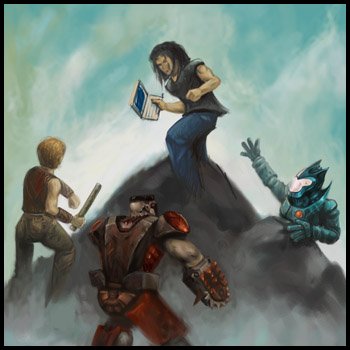
You can see the fogging idea at the bottom isn't really working, and Loonyboi is yet to get his real face (apparently John Travolta had it). The next character to be tackled was the one just peering over the mountain on the left. I went through a lot of different ideas for that position, trying to work out which game character would fit there the best (and was going to be fun to paint). I ended up going with a character from Messiah which, due to her design, could also be seen as a Borg from the Voyager game. Dual roles :). That character was added very quickly; perhaps 5-10 minutes.
The rocks were next. It was also at this stage that I decided to remove the fog idea altogether and just have the rock all the way down, although with less contrast towards the bottom. The rock designs, looking at them now, don't really look terribly rocky, but it's somehow an interesting look anyway. They were drawn just by drawing lots of nearly random areas of dark, then highlights in places suggested by the addition of the darks, and finally some splashes of colour added over the top. I wanted them to be pretty low-key, but still be interesting.
With the rock finished, I still had a bit of time left and there was a big gap in the bottom-right portion of the image so I decided to add another character. Choosing one wasn't hard - being a Star Wars fan - although the reference I had for a back view of the Episode 1 Battle Droid was very small (1cm x 1cm), so the droid was largely guess work. Having seen the movie now, I can see I got it about half wrong, especially the colours, but in the context of the image he works well.
All done? No! I still had Loonyboi's head to do. I found a good reference image on the net and basically just kept drawing lines until it looked like him (although Loony tells me the character looks more like John Romero now ;). I worked on it, pretty casually, after work each night for about 3-4 days.
Text written by Sumaleth for GameArt.com