

GameArt Spotlight #31
"Original Gibber" by O. Seng
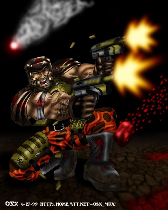
Image details
- Title: Original Gibber
- Gallery ID: 00633
- Artist name: O. Seng
- Posting date: 1999-07-18 (a Sunday)
- Artist website: http://www.mkx.org/users/osx
- Tags: quake, quake2, quake, 2, quake3, arena, quake, 3, arena, quake3:arena, killer, guy
- Image size: 52.31 KB
- Votes: 31
Please be sure to read the Copyright & Legal information text on the About & Help page.
Spotlight article
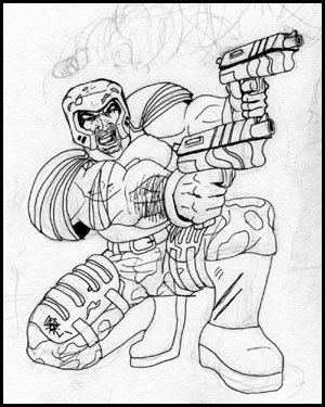
Usually, I would draw some thumbnails of how I want the picture to end up (unfortunately, I didn't save the thumbnail here). When you aren't worrying about every little detail, it gives your work more expression, I think. So after drawing something I like, I blow it up with a really messy sketch. Then I have to find some primary lines and draw a cleaner outline of the sketch. Afterwards, I erase the pencil work. This is kind of how comic books are done except I'm not using the standard comic book style crosshatching because I know I will have paint to express the shadings. So here's how the work will look like.
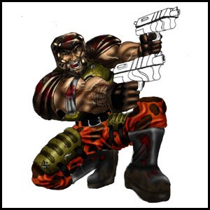
Still messy but overall simple. For this particular work, I painted it in a super large size(by my standards anyways) of 1200x1500 pixels because I read how reducing the image would make it look better. Usually, I use layers in Photoshop, paint in sections with a general color with multiply as the blending mode so I can see the lines below. Since this artwork was so huge, I really couldn't save all the layers so here's the end results. Usually, I would use dodge and burn tools to shade but sometimes they don't produce the colors I want and will have to manually use the airbrush and paint it in. Since each major section of the Quake guy is divided into layers, I can use "preserve transparency" to prevent me from coloring outside the lines, so to speak. After the basic shading is done, I go in and add little touches like veins, blood, specular highlights, battle damage, mud, wrinkles, creases, etc. A lot of these effects rely on layers and blending these layers the right way.
After the Quake guy is done, I work on the guns - painting it like I painted the rest, added some lighting and whatnot... a lot of the little touches. Eventually I painted the background black(which is harder then you would imagine since the "background" layer is just a black and white drawing so a simple fill don't work). The floor is a standard Quake3 floor faded to the black background with blood stains added.
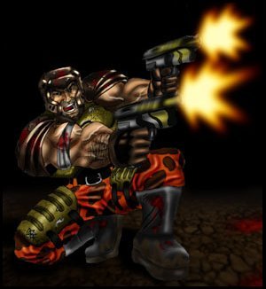
Keeping up with the gory concept, I added a gib in the spirit of Quake1 with bloody particle trail. I eventually added the spent shells with some nifty motion trails. They were cleverly placed not to obstruct anything important.
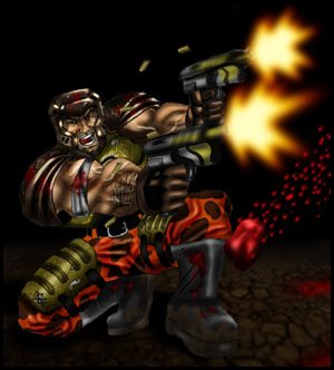
Oh yeah, looking back at the original concept art...there's supposed to be the rocket flying above. I think this is the first time I spent more than a day on a piece of art and it did pay off. You start off fresh each time and your work ends up better. All there's left to do is to flatten the image and reduce it to a manageable size. Yeah, it does improve the image somewhat because of the filtering.
Text written by O. Seng for GameArt.com