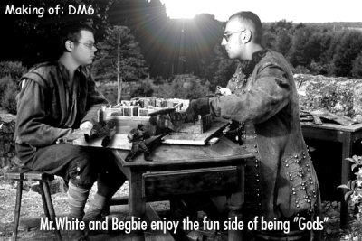
GameArt Spotlight #4
"The Making of DM6" by Mr. White
Image details
- Title: The Making of DM6
- Gallery ID: 00439
- Artist name: Mr. White
- Posting date: 1999-01-10 (a Sunday)
- Artist website: Unknown
- Tags: quake, photos, levels, maps, deathmatch, editors, designers, people, real, gods, creators
- Image size: 31.02 KB
- Votes: 60
Please be sure to read the Copyright & Legal information text on the About & Help page.
Spotlight article
Actually I've made this picture a long time ago (maybe half a year). I always like to do collages like that, in which I put myself or friends in pictures from movies or game-scenes.
The idea for "The Making of DM6" came when I saw this picture on the Movieweb. It's from the movie "The Man in the iron Mask", the movie sucks by the way. The two guys in the original Picture are planning something about the little model of a castle. So I thought it would be cool to do some "Quake-Art" over this.
Next I took two pictures of my friend and me (with correct positions and lightning) with my Digital Camera from Minolta. For Manipulating my Pictures I use Photoshop 4.0 and sometimes Simply 3d. Before the fun starts, I have to cut out the clothing of the people in the original picture, especially around the neck of the actors. I store them as different layers somewhere else. After that I cut out our heads, I place them exactly over the ones in the original picture. Maybe with a little adjusting in size, brightness, contrast and color.
Now I can put back the "neck-clothing-layers" from the original onto the new heads in the picture, so our faces don't look like overlapping flesh-pieces or gibs. I also add some shadows and blur filters (if it's needed around our necks) to give the picture a naturally-looking style.
I took the little Quake-Guys from some other Pictures of me or made a screenshot of a corpse in Q1 and changed size, color or contrast. They must also have the correct perspective like our heads, otherwise it wouldn't look realistic. I placed them as layers over the Picture and added some shadows.
Near the final stage of my picture I always like to add a lensflare (nice to look at, and realistic too) and some catching phrase, like the one you can read at the bottom.
This took me max 2 hours to do. Depends on my mood, d'oh.
Text written by Mr. White for GameArt.com


