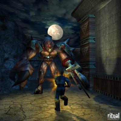
GameArt Spotlight #5
"Battle Against Thrall" by Beau Anderson
Image details
- Title: Battle Against Thrall
- Gallery ID: 00444
- Artist name: Beau Anderson
- Posting date: 1999-01-12 (a Tuesday)
- Artist website: http://www.ritual.com
- Tags: sin, thrall, fire, big, moon, battle, fight, cop, blade
- Image size: 40.28 KB
- Votes: 62
Please be sure to read the Copyright & Legal information text on the About & Help page.
Spotlight article
Thrall Battle started as a concept composite that I did for Game Developer Magazine's March 1999 cover. I started by taking a few screenshots of the final level of Sin where you fight ThrallMaster. I spawned the characters into the level and posed them into what I thought was a fairly interesting concept. After much communication with the magazine's art director we decided to go in a different direction and varios other conceptual images were made. After I finished the final cover I still kept envisioning how cool the Thrall Battle art could be, so I decided to go ahead and do it in my free time. I was fortunate because I had originally done all the textures for the Sin level where the final battle takes place so I had most of the high-resolution source art for the textures. I also did the in-game models and skins for ThrallMaster and Blade, so posing them and getting them into the scene wouldn't be a problem. The sky texture was also taken from some clouds I made for the skybox for this level.
The scene was built in 3ds Max 2, and is actually very simple in terms of mesh complexity. The architexture is mostly made of boxes and other simple primitives except for the upper ridge of the tower on the right, which is a thick L-shaped curve lofted on a rectangle. The floor and sky are simple boxes. The moon is a thin cylinder placed a few meters behind the head of ThrallMaster. Actually the most time consuming part of this piece was the mountinous pit walls in the background. I started with a patch grid that was fairly dense and applied a displacement map to it to get it looking rocky. I then bent it around the back side of the scene and bent the top back so it looked rounded. I did a lot of tweaking by selecting areas I wanted to change and moving vertices around with Affect Region checked. I actually had to copy the rock mesh and flip its normals so it would cast shadows correctly. I wasn't sure I was happy with the rock mesh until I worked on the texture map, which sold the illusion. A good texture map on bad mesh is better than a crappy map on good mesh any day in my book -- especially with organic looking objects. The last piece of mesh I slapped in was the muzzle blast from Blade's gun. It is an image I rendered out in GenesisVFX for Max and then touched up. I applied it to a paper-thin box and made an alpha channel for it to define its opacity and stuck it on the end of the gun. The entire scene weighed in at about 15,000 faces, most of it due to the rocks. The Blade model is about 650 and ThrallMaster is around 1,500.
I spent a lot of time on the lighting. I see so many images that could have been cool if the artist had spent more time on the lighting. I personally like to light the scene as I work on the mesh and textures - probably not the best idea but it keeps me interested in my scene and lets me play with lighting styles while I go. There are 16 lights in the final scene. The most notables are a couple of dark blue spotlights high over the scene, a directional yellow light coming from the moon, and an orange omni light for the muzzle flash. Normally I don't use many omni lights but in Max 2 omni lights can cast shadows so I used one here. I turned on its attenuation so its brightness would fall over over a distance and not light up the entire scene. There are also a lot of "fake" lights used to fill places that don't get enough light or don't cast shadows how I want them. For example the orange omni light in the middle excludes the Blade model from casting shadows. I made an orange spotlight and pointed it at him so the shadow came out how I wanted. This may not be as "correct" as the omni shadow, but it looks better and that's what I care about.
I have used this image as my background wallpaper for a week or so and looking at it every day has made me critical of certain things. For one, the moon is obviously in front of the clouds. I could have placed it behind the plane of clouds and given the cloud texture some translucency but that would dull out the shine of the moon and also the clouds. There's no really good solution I can think of in a hacked together scene like this one. Also, I wish I would have lit up Thrall's right arm more and had it cast a cool shadow on the rocks - it would have made the scene more exciting. I also should have turned his left arm so you can see the sawblade. It is somewhat difficult to tell what it is. All in all I was pretty happy with the scene and total time devoted to putting it together was probably only about 6 hours.
Text written by Beau Anderson for GameArt.com


