GameArt Spotlight #53
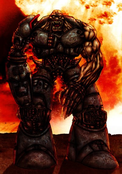
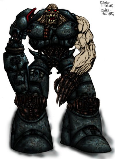
"Bio Deathborg" by Costas Koniotis
Image details
- Title: Bio Deathborg
- Gallery ID: 00708
- Artist name: Costas Koniotis
- Posting date: 1999-09-27 (a Monday)
- Artist website: http://www.3dpalette.org/coskoniotis
- Tags: quake2, quake, 2, monsters, fire, hell, satan, mechs, paintings
- Image size: 52.1 KB
- Votes: 21
Please be sure to read the Copyright & Legal information text on the About & Help page.
Spotlight article
Firstly I draw my artwork on paper and then scan it up. If you prefer to do it straight onto the comp that's cool, it's just I dont have a graphic tablet and have to use the mouse. I prefer working on pen sketches rather than pencil because I find them easier to work on, but I'll leave that up to you. If you are scanning up your image, convert it to greyscale and use the "Levels" or "Brightness + Contrast" to get rid of grey area's and convert back to RGB or CMYK.
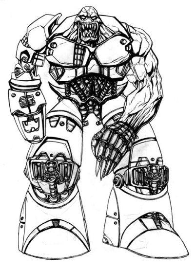
So now time for some colour. Create a new layer and set that to multiply, now you can colour freely on that layer without losing the black outline. Because I wanted the borg to look damaged and not like it just stepped out of a toyshop =) I used a rock texture on a new layer set that to softlight, then played with the opacity and colour till it kinda fitted. Textures really help if your going for a more realistic gritty type of look which is what I wanted for this pic.
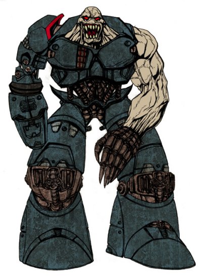
Next step is to get it looking more 3D, for this I use the Burn, Dodge, Smudge and Cloning tools set at different options to get slightly different effects and using a feathered brush to get a more blended look. For this actual piece I used the Burn set to midtones for the shadow, the Dodge set to highlights for the lighting, then used the smudge and clone tools for neatening areas.
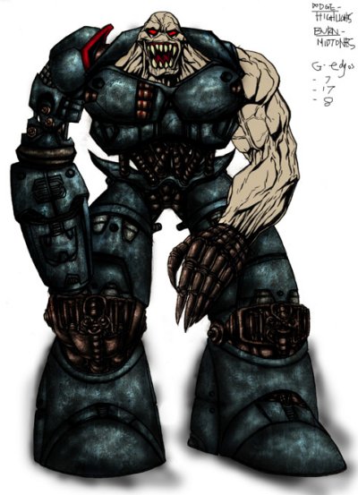
Well apart from the skin which I used the same shading method on, I wanted the suit to look more wartorn. The way I did this was duplicating the layer, erased the head and arm, then experimented on it with the filters. I settled for Glowing edges, setting the layer to difference and lowering the opacity which kinda worked out, then I rubbed out certain area's so it didn't look overdone.
I decided using a combination of my artwork, photo's and filters would be best for creating the background. The floor was just drawn in plain colour, textured and shaded. The fire was a photo of smoke which was distorted and altered using Levels and Colour options. Then I painted into the background and used the filter Paint Daubs to get the look I wanted. The shadow on the ground I painted onto a new layer and set to low opacity. To light the borg I made another new layer and painted in the lit areas, experiment with the layer options for this bit. Then I adjusted the colours and levels for the final touch.
Text written by Costas Koniotis for GameArt.com


