

GameArt Spotlight #55
"Hello Nurse" by Francis Tsai
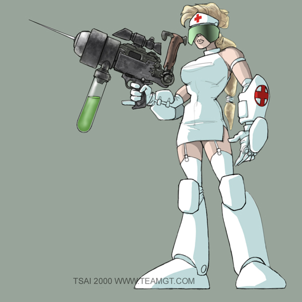
Image details
- Title: Hello Nurse
- Gallery ID: 00885
- Artist name: Francis Tsai
- Posting date: 2000-04-21 (a Friday)
- Artist website: http://www.teamgt.com
- Tags: Starcraft:, Brood, War
- Image size: 23.32 KB
- Votes: 32
Please be sure to read the Copyright & Legal information text on the About & Help page.
Spotlight article
This is a very simple, graphic composition (i.e. no background other than a medium tone). It's done in a cartoony style that's sort of a cross between anime and the "animated adventures" look of the Batman and Superman tv shows. I often set up drawings this way so that they can also be used as desktop wallpapers. The solitary subject against a blank or subtly graded background works well for that purpose. In addition, I tend to size the original at 1600 by 1200 pixels, at a resolution of 200 dpi. Once it's done, I save out a copy at 72 dpi for desktop use - 1600x1200 reduces to most of the popular screen resolutions.
The subject of this drawing is a gratuitous caricature that would probably not impress a lot of women. I know my wife rolled her eyes when she saw it. This being the case, I decided to use the cartoony style I mentioned earlier. Somehow a drawing of this sort is a little easier to take when it's done in an exaggerated style like this.
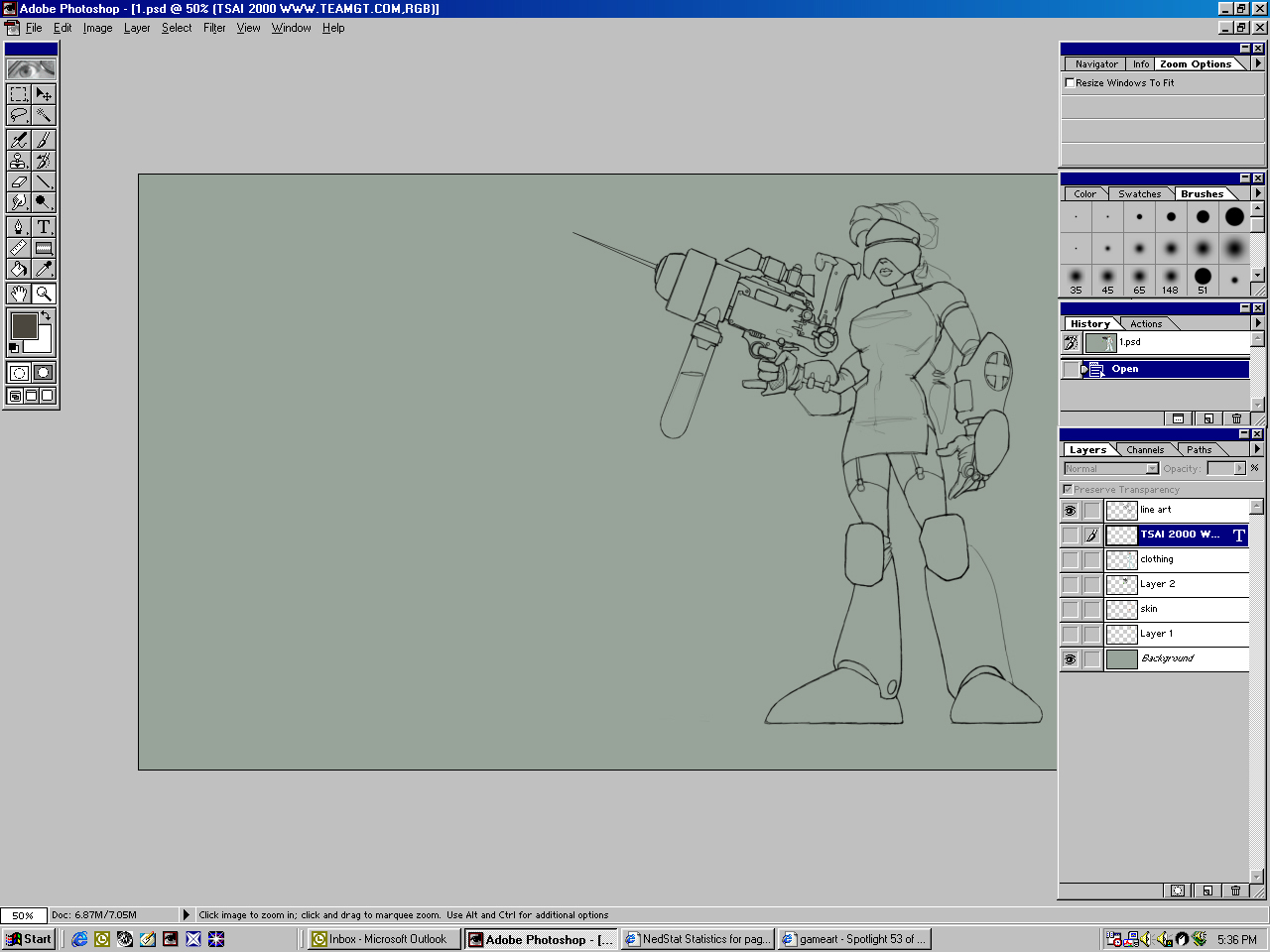
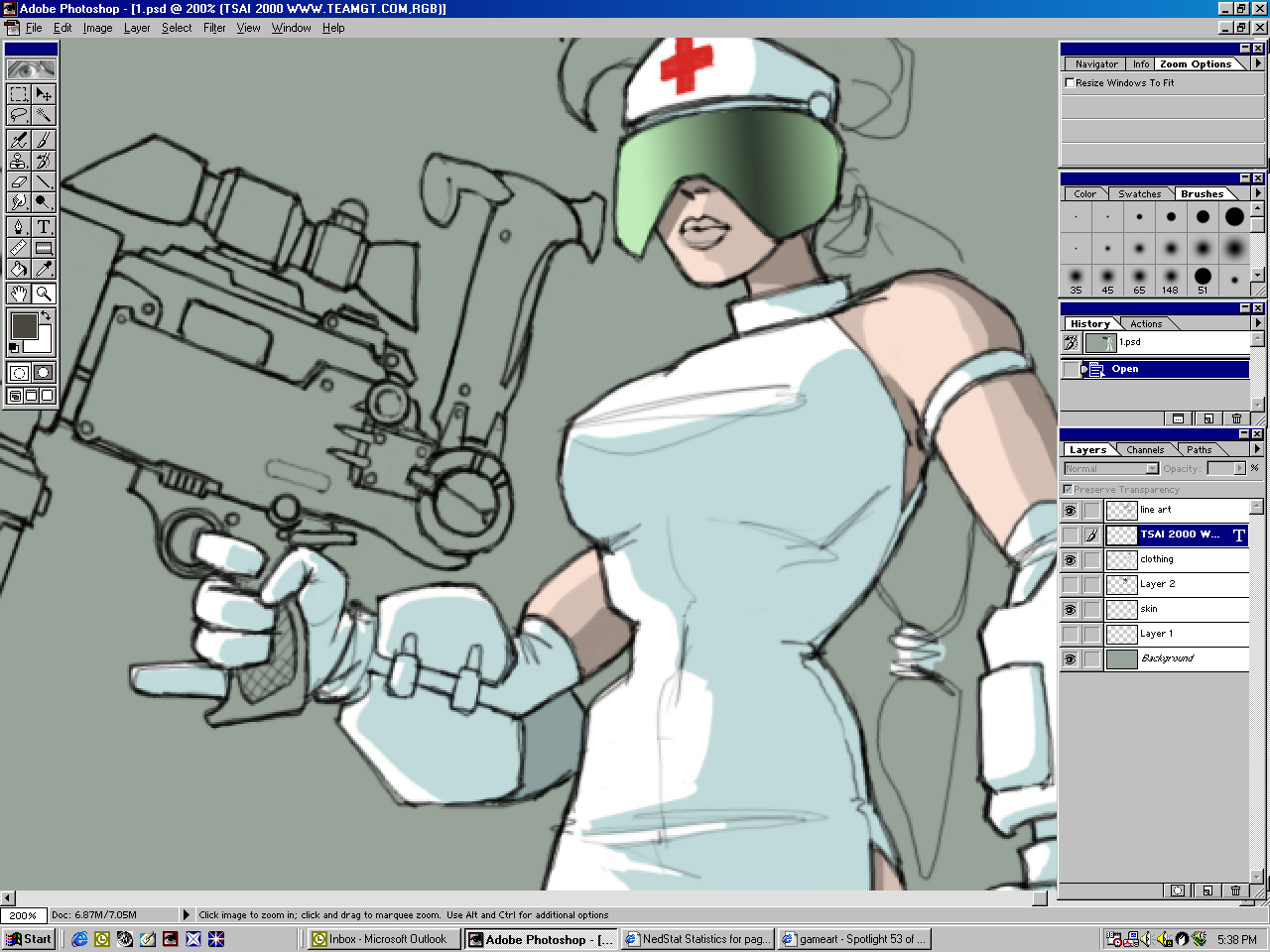
Figure 1 shows the basic layout. I started this one right in Photoshop, using a 4x5 Wacom. At work I use a 9x12, and I've found that the smaller tablet is actually a little more comfortable to use. About half the digital stuff I do starts out as a pencil sketch, and the other half lives its whole life in Pshop.
For the basic line art, I use the airbrush at 100% opacity with pressure sensitivity on. I don't have earlier versions of the sketch saved, but basically I start out with a general gesture sketch which is sort of made up of primitive volumetric shapes. (The screen capture shows the layers as they are at the end of the drawing process. Normally I fill the background layer with a neutral color, and then add a new layer over the background layer and draw on that.) I've reconstructed an example in Figure 2.
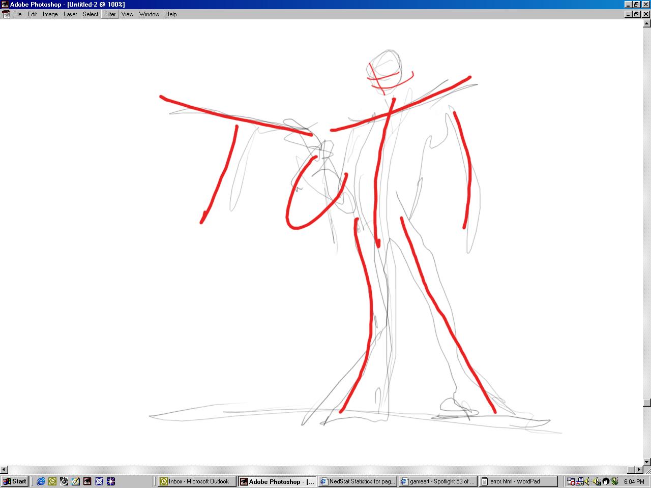
Because I'm going for an exaggerated, cartoony style, I pay less attention to anatomy and proportion. Instead, I concentrate more on getting a certain attitude or "line of action" in the drawing. I've added red lines over the sketch to show the lines I want to emphasize. Once the basic structure of the drawing is established, I go back and start refining and cleaning up the shapes and details.
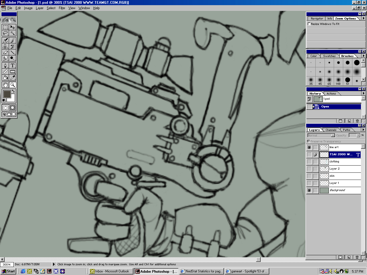
Figure 3 shows the drawing zoomed in to 300%. At this point I try to keep the detail work as simple as possible. I know that in this area, most of the color will be pretty dark, and a lot of the detail can be implied with the right highlights and shadows later on.
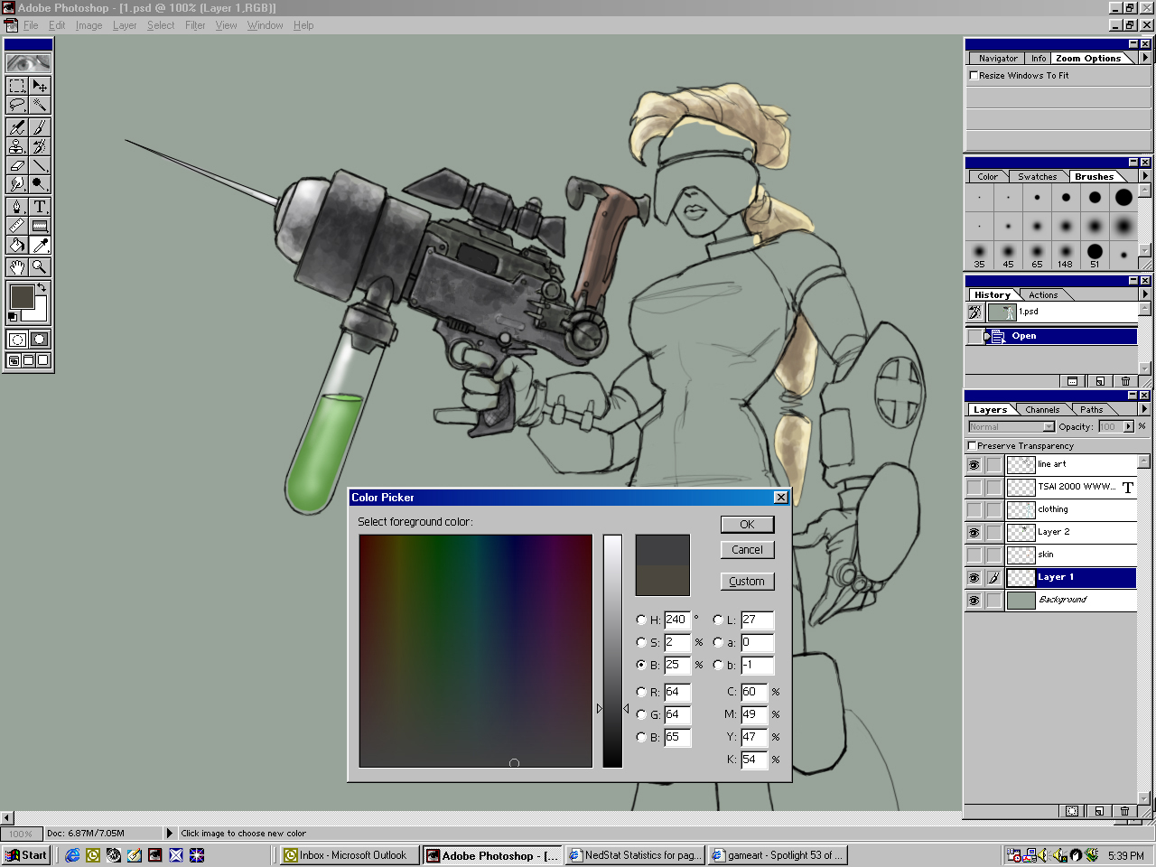
Once the line art is complete, I change the layer's mode to "multiply" and drag it to the top of the stack. I then create a couple of new layers beneath the line art layer, set to "normal." These are the layers that will contain the color work. This layer setup allows the line art on top to remain unaffected by the painting below but allows the colors to show through, so it retains that cartoon/line art look. To add the color, I simply lassoed most of the areas and filled with a basic flat color. I then did some of the shading work with the paintbrush at 100% opacity. The shadow colors for the skin and clothing are painted over the base color right on the same layer. If I were really anal, I suppose I would put shadow and highlight colors on separate layers as well.
For the gun, I wanted a look that would contrast a little bit with the clean graphic look of the nurse, but which would still fit into the look of the piece as a whole.
Once the basic flat colors of the gun are laid in, I go back with the paintbrush set to about 25%-30% opacity. I sample the base color and increase or decrease the value of the color, depending on whether I need highlights or shadows. Highlights are added with the paintbrush set to "normal" or "screen" and the shading is done with the brush set at "normal" or "multiply." I've tried using dodge and burn, but I find that I like the ability to tweak the color a little bit.
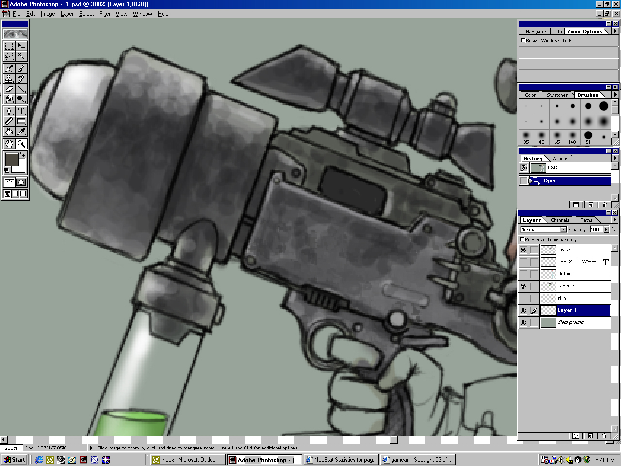
Figure 6 shows a closeup of the painting process on the gun. As you can see, it's really pretty messy - I'm not being that precise in terms of delineating details. All I'm doing here is making sure that all the highlights and shading are consistent in terms of placement across the the surface of the gun. The viewer's eye will fill in a lot of detail - you don't really have to draw every single greeble, and in fact you shouldn't. In general you're not trying to catalogue every bump and cranny on a given object - you're creating (or recreating) an impression of a character or object at a certain moment in time.
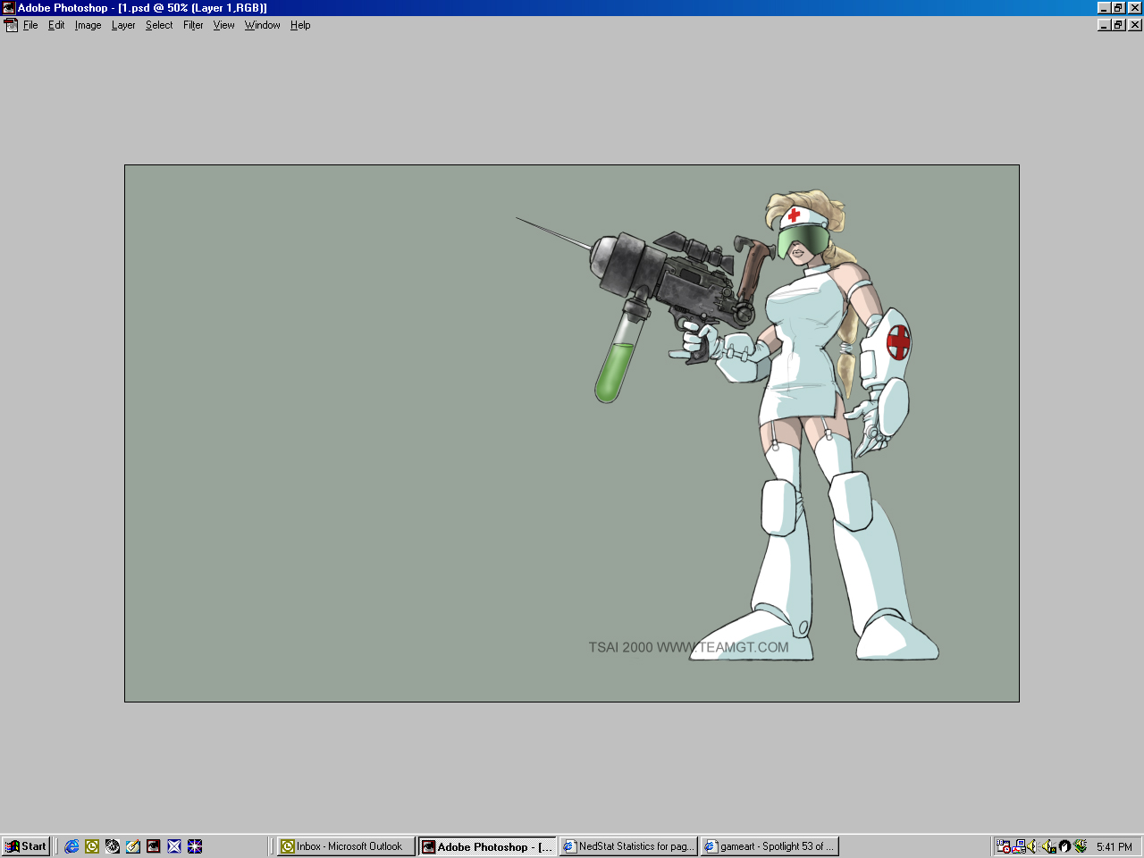
Once all the painting is done, I add my sig in a prominent place to satisfy my towering ego, and send it off to wherever.
Thanks for your time.
Text written by Francis Tsai for GameArt.com