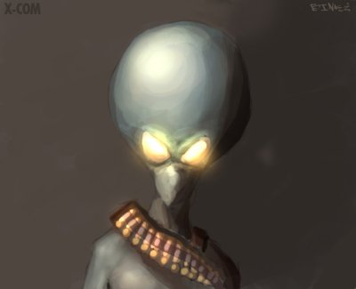
GameArt Spotlight #62
"The Government is denying it" by Binke
Image details
- Title: The Government is denying it
- Gallery ID: 00903
- Artist name: Binke
- Posting date: 2000-05-14 (a Sunday)
- Artist website: http://binke.gamesquad.net
- Tags: X-COM, xcom, UFOS, enemy, unknown, Terror, from, the, deep, Acopalycse, paintings, aliens
- Image size: 9.24 KB
- Votes: 26
Please be sure to read the Copyright & Legal information text on the About & Help page.
Spotlight article
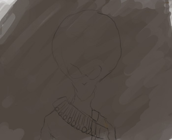
Hello, hello its Binke here.. So well, lets take a look at this strange little fellow. For starters I used my Wacom Graphire, and Adobe Photoshop 5.0. I started out by just scribbling some brown paint over the canvas with the paintbrush, to get some sorta texture.

Then I took a darker value and started to do a little basic outline of the sektoid so that I could get a pretty clear view of how it would look.
After that it was time to add some color to it, I started to do some basic shading with the paintbrush and hardbrushes @ 100% opacity to the head & neck, keeping in mind where the light source is coming from.
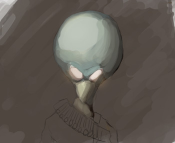
Then I refined it more, adding details finished the head off with giving it a hard shading & some glows on his eyes, using color dodge & screen layers (new layer - change layer attributes to screen for glowy stuff on eye, and color dodge, for shiny stuff on eye, then paint on!).
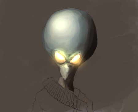
I didn't zoom that much on this picture, therefor it's quite rough. But that is how I like it. I also flattened out the background here. The rest of the body was done pretty much the same. Laying down basic shapes & shadows with the paintbrush
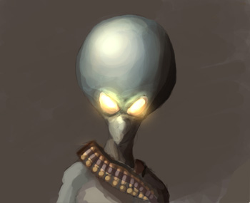
and then refining it some.. also I didnt want the belt to be that detailed, so I just blobbed some colors on it, and gave it a glow. Well that's pretty much it,after that it was just some touchups here and there, making it look good, and I am quite satisfied with this piece I must say, although it could have been more detailed..and his head is a weee bit too big, the pose is boring, boring background, to rough etc.
Ah well, I hope this has been helpfull at some point of degree..Ta'!
Text written by Binke for GameArt.com


