GameArt Spotlight #63
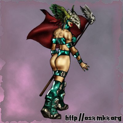
"Flag Hunting" by osx
Image details
- Title: Flag Hunting
- Gallery ID: 00909
- Artist name: osx
- Posting date: 2000-05-24 (a Wednesday)
- Artist website: http://osx.mkx.org
- Tags: quake3, arena, hunter, models, skins, girls, women, woman, players, sexy, paintings
- Image size: 25.98 KB
- Votes: 21
Please be sure to read the Copyright & Legal information text on the About & Help page.
Spotlight article
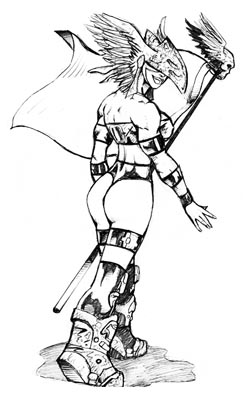
"Flag Hunting" is actually a deviation of how I usually do art. Typically, I would begin with a sketch much like this:

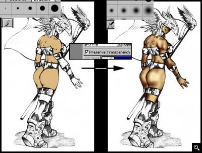
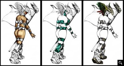
The sketch is usually much messier than this, but I had originally done this pencil art as a line-weight study, so it's pretty clean. This makes it a perfect candidate for doing a different technique. Normally, I would use the messy sketch as the background and create layers above it in PS using MULTIPLY blending mode. This time, however, I put the sketch on the top layer in multiply mode, and create opaque layers below it. Using my Wacom tablet, I use solid round brushes and fill sections in different layers that will be grouped together. I made layers for skin, clothes, boney sections, flag, etc. Once the outline is filled out nicely, I toggle on "preserve transparency" so when I paint the solid sections, I don't have to worry about staying in the lines.
I can then zoom in and start adding shading and highlights. I used to use the notorious dodge/burn technique but I too find it doesn't work well with skin tones. So you have to experiment with the blending modes for your airbrush. I use multiply to darken area and overlay to brighten/highlight areas. Sometimes I might use color dodge blending, softlight, hardlight, screen, etc. if it gives me what I want, so you really have to experiment.
A great thing about using normal opaque blending for the colored work is you can easily paint behind sections without having to worry about overlapping the sections which is a major problem with having all the layers be in multiply blending mode since it would multiply the overlapped colors and you have to clean it up. So I had a bunch of layers and worked in detail on each layer without worrying about how it would effect the layers below it.
Once everything looks cool, I touch up everything. I make sure I shaded consistantly with a directional light, to give it a realistic look. Add a background, and it's done. This was really a simplistic art so there isn't too much to explain.
Text written by osx for GameArt.com


