

GameArt Spotlight #65
"Thirsha's Decent" by Eric Klokstad
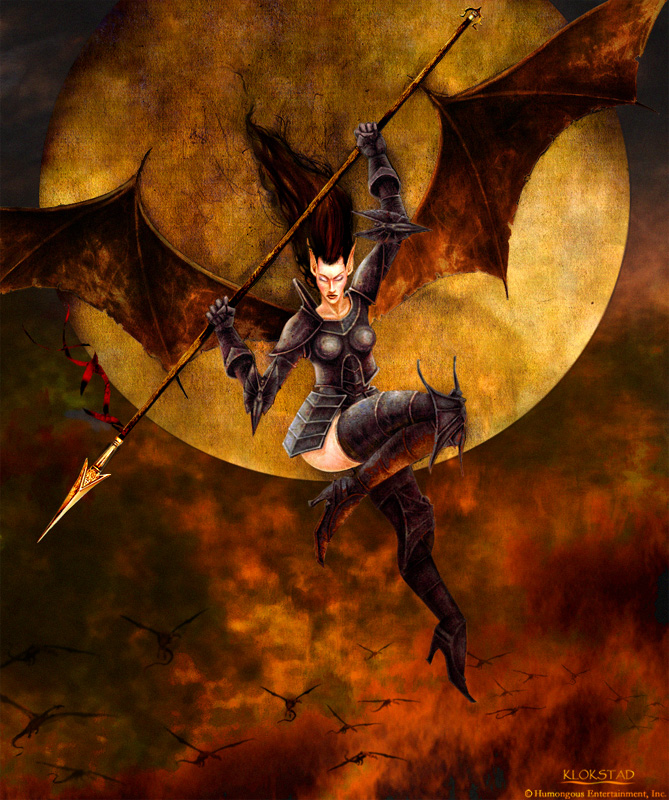
Image details
- Title: Thirsha's Decent
- Gallery ID: 00914
- Artist name: Eric Klokstad
- Posting date: 2000-05-29 (a Monday)
- Artist website: Unknown
- Tags: Kingdoms, paintings, women, woman, girls, moons, night
- Image size: 40.39 KB
- Votes: 29
Please be sure to read the Copyright & Legal information text on the About & Help page.
Spotlight article
Thirshas Decent is a painting I created for a PC game called "Kingdoms".
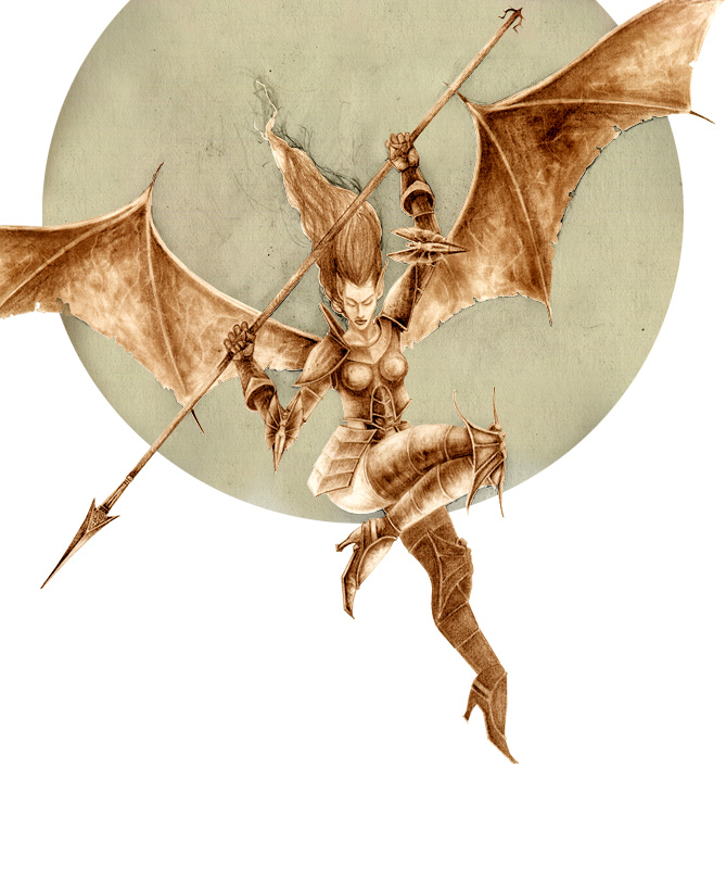
Thirsha started out as graphite rendering as does about 80% of my digital paintings. Ive worked on computers for about six years but I still find it easier and more relaxing to draw on paper. Ill work on the drawing as long as time permits. Ive found that the painting process goes smother the more refined the drawing is. I shade lightly and try to convey volume and form. I wait till its in the computer to bring out a light source. The composition is also worked out in the computer. Its so nice not to worry about placement and scale while drawing. I scan the drawing in at a high resolution. If there isnt a size requirement Ill work around 1200 by 1600 pixels at a resolution of 150.
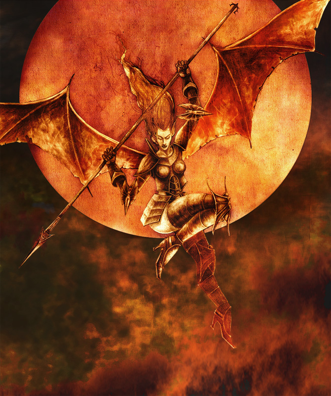
The first digital step I take in Photoshop is to mask all the elements of the drawing. Once this is done, I use a combination of brightness/contrast, hue/saturation, and variation to adjust the values and color. Tweaking the brightness and contrast strengthens the subtleties of the graphite drawing at your discretion. Adjusting hue/saturation and variation is an important step for me. It takes the drawing out of black and white and into a color tone that will set the mood of the painting. I wanted this painting to have a warm color scheme so I chose a sienna tone for Thirsha. If I wanted a cool scheme, I would have picked a blue or purple tone for her.
The second step is to create the background because it further helps me set the mood and tones of the painting. The sky I created is a combination of hand painting and numerous sky photos mangled together using layer effects and color adjustments.
The next step is to overlay the drawing layer with the background sky layer. I use transparent layer effects like multiply, overly, hard light, and soft light to get the effect of a painting term called a "wash". This helps meld subject and background so they dont look pasted on top each other.
The next stages arent in any particular order. Her skin is hand painted. Going for a painterly look, I leave a little of the drawing to show through. Her armor is a metal photograph texture. On a separate layer I use transparent layer effects and opacity adjustments to get the right mixture of drawing and metal. I then merge the two and use the burn tool to darken shadows and the dodge tool to bring out the highlights. The reflected color on the leg is the airbrush tool with the color option selected. The wings were masked on a separate layer and then filled with a dark brown. I then turn the layer to multiply and erase out the midtones and highlights. Sometimes Ill do this process multiple times with different colors and opacity levels until I get a rich look of colors. Its a similar mixing and layering process used with real paint.

The final stage is making sure that everything looks as if it were created on one layer. With all the major elements complete, I flatten the layers. I do keep all of the mask information for additional adjustments. Final details are put in last and a few color tweaks are made. I sometimes use filters to blend everything together but the smudge and blur tools usually do the trick.
Well, hope that made sense... Keep on keeping on.
Text written by Eric Klokstad for GameArt.com