

GameArt Spotlight #74
"Anarki" by Hot Soup
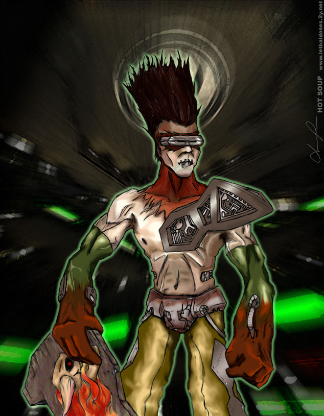
Image details
- Title: Anarki
- Gallery ID: 00998
- Artist name: Hot Soup
- Posting date: 2000-08-30 (a Wednesday)
- Artist website: http://www.lethaldoses.2y.net
- Tags: Quake, 3, arena, models, girls, women, skaters, skate, boards, paintings, characters, action
- Image size: 43.5 KB
- Votes: 24
Please be sure to read the Copyright & Legal information text on the About & Help page.
Spotlight article
I started this drawing back in February, shortly after I picked up my copy of Quake 3 Arena. The characters in Q3A never grabbed me, because realistically, they're just player models. Their stories don't matter to play the game, and the models themselves don't actually play different. So, while flipping through the manual, I saw Anarki. How dumb. He can't even spell his name right. But it wasn't until I was running around on some new server, fragging here and there, that I saw the hover-punk skate past me, dipping his board up as he took a corner. It just looked too cool. The player model eventually became my favorite, and I had to do a piece about it.
Shortly after, I started doing an online comic called Lethal Doses. This picture lost my attention, falling into the pile of unfinished pieces, half colored and stagnant. Well, I just recently put my comic on hold, so I went back to some of my old projects and finished up this work. So, here I give to you, in all his lanky, punkish glory, Anarki: the Quake 3 Arena underdog.
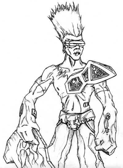
I drew the image while sitting around my apartment gabbing with my friends. I hate pencils, so the whole thing was drawn in pen. Done vertically on a piece of standard bond copy paper. I scanned it in, and started my coloring magic.
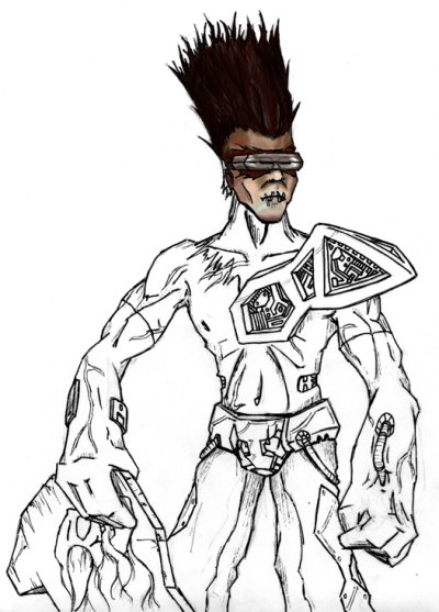
I used Photoshop 5.0 for this piece, with a wacom tablet as my input device. For my palette, I used the standard colors from Anarki's skin. I used basic shades, and colored in spots. Then I went over it all with the smudge tool, to give it a gradient, but also to simulate paint, somewhat. For some of the metallic pieces, such as his shoulder plate, I used the gradient tool, but afterwards went over it with the smudge tool to give it imperfections. I basically used the smudge tool everywhere. It softens the colors and the lines, giving it more of a hand-made look, as opposed to mechanically colored and drawn. However, I wanted it to keep a comic book feel to it, so I didn't make the chest plate look like real mechanics, instead it looks more like a fake ornament. Also, the lost soul on his hoverboard had to look like a decal, so it has some real fakey colors to it. I didn't bother shading it too much. The background is just a screencap from a level, warped, colored and twisted to all hell.
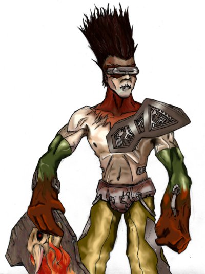
In total, I spent about twenty hours or so on this image, though that includes discarded work, so I'd say the finished product is about fifteen hours of that. I was really picky about the coloring. I like the end result, and I may try to do some more images of characters in the future.
Text written by Hot Soup for GameArt.com