GameArt Spotlight #75
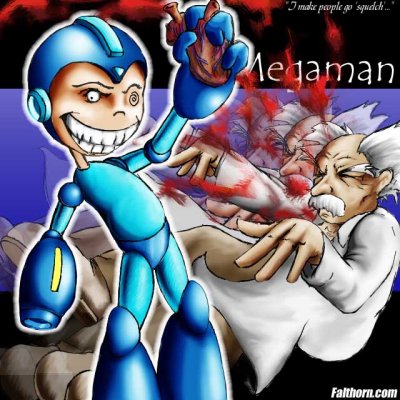
"Mega Heart Surgery" by Bryan Rathman
Image details
- Title: Mega Heart Surgery
- Gallery ID: 01008
- Artist name: Bryan Rathman
- Posting date: 2000-09-06 (a Wednesday)
- Artist website: http://www.falthorn.com
- Tags: Mega, Man, Series, halflife, walter, bennet, comics, jokes, brutal, hearts, mega, man, x, anime, manga, vs, versus
- Image size: 50.67 KB
- Votes: 24
Please be sure to read the Copyright & Legal information text on the About & Help page.
Spotlight article
Inspiration in this case wasn't really a factor. It's one of those extemporaneous drawings with a pretty paint job. Anyhow. The concept was utterly simple, so the details were important.
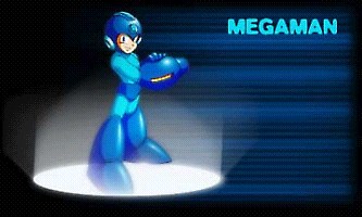
Polycount.com hosted a MegaMan Quake2 model, which on its own wasn't very impressive, but the reference image was perfect. It showed the indefatigable Blue Wonder in all of his innocent glory.
I should note that I work entirely digitally, so there's no pencil sketch. I use a Wacom Graphire tablet, and working from scratch in Photoshop is just as good and saves trees or something.
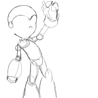
The rough sketch of the man.
Okay, Here we go. I've got the image already set up in my head, with MegaMan on the left and Wily on the right. You'll hear art professors through out your life tell you to sketch the ENTIRE image out first and fill in detail later. And while this is important for cohesion of all parts, it's not critical. I'm a loner, Dottie, a rebel. I've already started to smooth out the head at this point from a scrawled circle. After the initial sketch, we'll keep going. That right arm is bugging me.
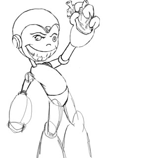
The arm is fixed, thank god. The torso is also shaping up with nice, thick cartoony lines. Old cartooning pros are major fans of the line. You'll see the difference, also, between amateur and pro lines. They say so much, but subtly. So beautiful. Anywho, he's got a face now. The maniacal stare with the loony "Dreamcast" eye is my favorite aspect. Gotta plug the Dreamcast at every opportunity.
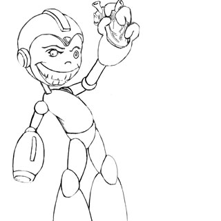
Okay, Doctor Megaman is done. Can't forget the little cortex on his helmet and the yellow strip on his blaster. Now that he's done, we'll make him his own layer in Photoshop and invisible so we can start Wily.
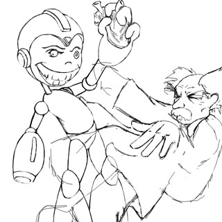
He's technically a background element, so I spent much less time focused on Wily. The only thing that really bothered me were his infernal HANDS. I couldn't envision them in an appropriately "falling" animation. Should they be clenched, flailing outward, or flashing a gang sign? I settled for the limp wristed pansy format instead. I'm not implying anything here, I'm just going by word on the street. ^_~ As a note for the design purists, I specifically arced his back in a contralinear form so I could point his far arm and legs to create dueling diagonals. Yeah.
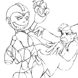
Wily's all nice and fleshed out, sporting Doc Martins and GAP khakis. Also, realistically, his shirt would be open to facilitate the heart removal procedure. Now that we've got both characters in working order and the design looks nice, we'll turn off Wily's layer and start coloring Mega man.
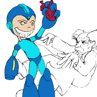
My favorite color add method is to put each color as its own layer to keep each from overlapping, and so they could be dodge/burned without too much trouble. I draw-fill each area with the appropriate color and a temporary base color for the heart, and at this point, he looks like his more familiar flat shaded incarnations. We'll fix that in a second.
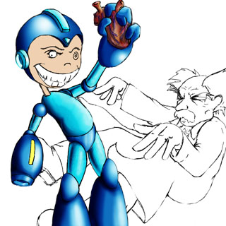
Bear witness to the joy of Dodge/Burn. The lighter blue area was unnatural to render due to its initial lightness. But I improvised by doing the metallic offset shadow on the arms and legs. A tip for metallic objects: Just stick random shadows and highlights where they don't belong. The heart is just a mishmash of organic colors and blue streaks for the veins. It turned out exceptionally well without much thought, so I left it at that.
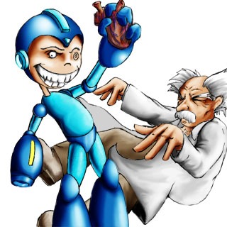
Now it's Wily's turn at the paint can. Like I said, he's a background object, so I just liberally add shadows and highlights randomly until he looks pretty. There are also a couple problems that'll come back to kick my ass later, but I'll mention those next during the "fluff" phase.
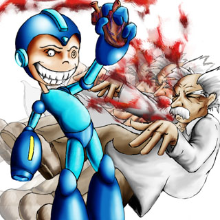
This is the "fluff" or adjustment phase. First, I collapsed all of Wily's specific layers and copy/shifted him to new layers for the cheesy motion blur. The blood is just about the simplest thing you can do in Photoshop for a cool look with minimal effort. PS already has plenty of pixel style brushes. It's just a matter of choosing the most gut wrenching colors and arcing the brush strokes to simulate movement in the right direction. Another rhetoric of art classes is "MIX YOUR FREAKIN COLORS, PEON!" and to an extent, this is true. Cell style and Cartoonist colorists just ignore this out of hand, but this image is intended for a more gritty, realistic feel. Adding a little purple and yellow/orange to the blood was just the little touch of realism that it needed. Too much realism would have become offensive (heaven forbid!). Anyhow, this is how I would be satisfied to leave the pic, and ideal for T-shirts! Originally, I the final image was a parody of Niko Geyer's portrait style, just for a laugh. But the design was simple and effective, so I ran with it. Plus, I like the 'squelch' quote from the silent protagonist.
As for the last regrets, the fact that I shifted the original image of Wily after I'd colored it opens up the not so obvious flaws in his uncolored shoes and unfinished hair. I'm always paranoid about stuff like that, but such a piece of art is so inconsequential, I refuse to fix it. As a final post mortem (ha! get it? GET IT?) the image is in no way an insult to Capcom's incessant production of innumerable sequels to its always prolific cashcow. Long live the Dueling Doctors and the ineffable Blue Wonder.
Text written by Bryan Rathman for GameArt.com


