GameArt Spotlight #77
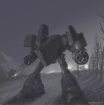
"Night Patrol" by Leonid Kozienko
Image details
- Title: Night Patrol
- Gallery ID: 01016
- Artist name: Leonid Kozienko
- Posting date: 2000-09-14 (a Thursday)
- Artist website: http://www.leoarts.irk.ru
- Tags: Mechwarror, 4, 3d, renderings, mechwarriors, robots, raytracing, metal, technology
- Image size: 16.74 KB
- Votes: 41
Please be sure to read the Copyright & Legal information text on the About & Help page.
Spotlight article
This painting was done for the upcoming Mechwarrior 4 game as sort of fanart. The image idea was not to try to achive photorealistic mech but to create a mood of Mechwarrior's night battles and patrols missions. So the painting process takes approx. one evening and morning. Quite fast for me, usually i waste a lot of time. First of all i start sketching on paper to research ideas how this mech can be designed.
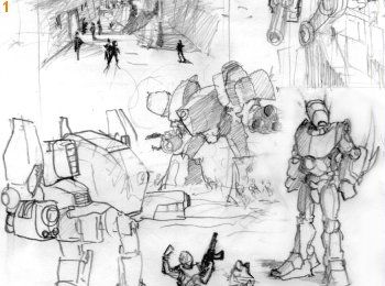
I don't focused on background and/or any additional details. Only basic shapes for the mech and his pose. After i've got appropriate sketch i turn on my PC and contined to work digitally. No scanning were done. I create a new image something about 300x300 pixels. Yes i started from a very low-rez file to set the composition and define basic colors. You can skip this step if your hardware allows and go to sketching in hi-rez file directly but for me it dosen't work smoothly. Next thing i do is setting up the environment gradient. Since it was a night i've put some dark colors for the sky and a few light colors for the horizon line. Ambient light is very low in this image so i keep in mind to use "dark" tones mainly. Also i quickly paint the ground.
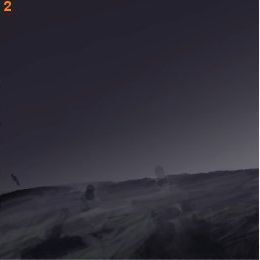
All to often i see how young artists draw their characters on a white paper, coloring them with "plastic" colors and putting on appropriate kind of background. This method is using in comics and cartoons but for painting it dosen't work well. In real life environment rules. For example if you'll go down the street in a sunny day - you'll see a lot of light and colors are very brightly but if you go to the same street at night you'll see another picture. Nothing has changed (i.e. cars, trees, your kewl boots) but we see them with another colors! The colors tends to be more darken. Why it's happen? It's because of our eyes. We see the world in reflected light, so in a day more light rays comes to our eyes with more lightpower - more details visible for us. Well need to stop this boring physics now. Just keep in mind that background environment is also important.
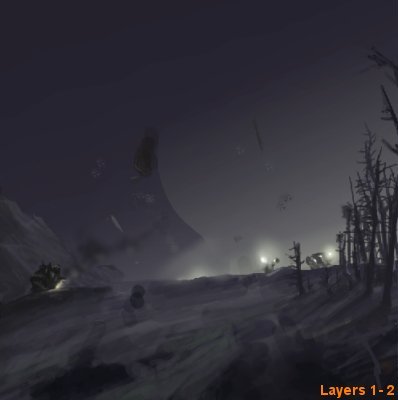
Back to the mech i drew his outline in another layer and filled it with black tones. After i'm done filling i paint visible parts of mech like guns, armour panels, etc. No any details yet! Then i just resample my sketch to 500%. So i've two layers - one for the mech and another with background. A few later i've added one more layer behind mech for the additional elements like trees, mountains, other mechas and spotlights. The reason to split the scene into layers is for better control. I can paint in single layer without a problems. But here i don't want waste my time for it. Next i begin refining and add details to the scene. More work on foreground mech and a few brush strokes for others - because camera focused on central mech. The process is boring - paint and erase, paint and erase ... nothing more though. Also i used masks few times to make shapes sharp and crisp. For blending colors together use brushes with low opacity. Not smuge! Airbrush with low opacity works well for spotlights, smokes... Use your image as a palette and take colors from it.
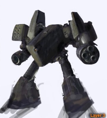
Uh... the work is done. But a bit later i come back and clean up some areas and repaint forest more carefully. Also i've added a couple of trees at the center.
Many people have told me that image is too dark and needs adjustment. This is an old problem. On your monitor image seems to be more darken while on your friend's - lighten and so on... (so because of that studios asked for the printed portfolio more) I can only suggest to paint image in a higher key to do all details then reduce lightness to match your screen. Another people always will see details after adjusting, not only those black holes. Same things happen while i viewed some of Craig Mullin's work "Wow! They are all too dark for me! I didn't see anything" - i thinked, but after adjusting a lot of details appears in those "black areas". Anyway it's not a main problem. Stay on the image idea and design first.
Text written by Leonid Kozienko for GameArt.com


