

GameArt Spotlight #79
"Intoxication" by Rasmus Selker
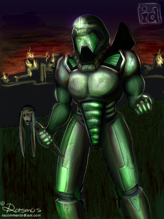
Image details
- Title: Intoxication
- Gallery ID: 01027
- Artist name: Rasmus Selker
- Posting date: 2000-10-14 (a Saturday)
- Artist website: http://wizzart.cjb.net
- Tags: Doom3, Doom, 3, Doom, 2000, Doom2000, year, 2k, players, models, doom, classics, revivial
- Image size: 35.94 KB
- Votes: 31
Please be sure to read the Copyright & Legal information text on the About & Help page.
Spotlight article
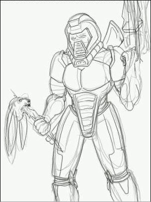
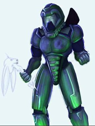
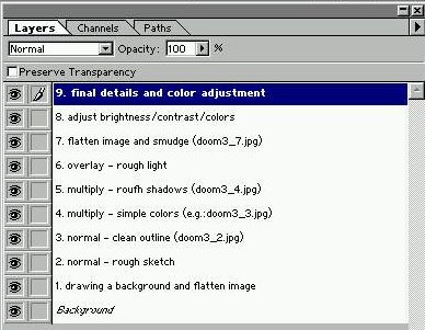
Before i start with the single steps it took me to draw this piece i want to explain my basic structure of digital drawing. For this reason i prepared a small screenshot which shows how i use to arrange my layers. Layers are the safe way of drawing. Just create a new layer whenever you experiment. What i do is to create layers for every single drawing mode instead of setting the paintbrush tool to a certain mode. This means that i can simply delete a raped layer instead of hoping that the history gives me enough "undo's" (In a few mins you will know what i am talking about). I usually start with the background. Its best to have it done before you start drawing the character so the character really fits into the scenery. In this case i didnt want a detailed background. All i planed was a dark ground and ruines so i began with a rough sketch of the character ON A NEW LAYER set to NORMAL(mode). Next i create A NEW LAYER set to "multiply" and fill areas with single colors. Up to this point i recommend to work precisly! Use the paintbrush with a tiny hardshaped brush for the sketch and the clean line. For simple coloring chose a big hardshaped brush so you dont accidently produce gradients between two differently colored areas. After that its usually useful to save and then flatten the image so u can always "retry" any single layer, may it be a wrong shadow / lightning / color or whatever.
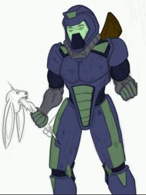
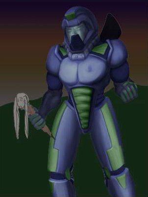
Now we have reached step 5. of my usual order. I create A NEW LAYER set to "multiply" and begin drawing rough shadows with a big soft paintbrush; opacity set to 10-20%. Now you might wonder why i set the layer to "multiply". Well, In my opinion the multiply mode is the best one to produce realistic-looking shadows on materials. The most realistic highlights on materials can be achieved with the "overlay" mode. Its important to know which colors to use with which kind of mode. For example "dodge" will only work if you draw with a bright color on a dark one (e.g. white , BRIGHT yellow/..green/..blue/..anything). Its the opposite of burning: Use a dark color on a light one to burn. Dodge and burn are very helpful when you know how to use them, but most often it leads to a cartoony and somehow psychedelic look. Just in case you are not familiar with the common effects of a certain mode its best to experiment a bit.
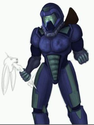
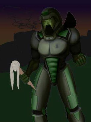
Uhm, back to the example: On doom3_4.jpg you can see what it should look like kinda, but so far no hightlights have been set! Consequently i creaty a NEW LAYER set to "overlay". As i mentioned this mode looks more realistic than "dodge" for example. Now i chose a big brush and place a few rough highlights (see doom3_5.jpg, helmet, chest, fingers). After this i blurred both layers, multiply(shadows) and overlay(highlights). Then i flatten the image and guess what: create a new layer set to multiply to draw a more precise shadow. Same with highlights: create new layer and place more precise ones. This way i carefully make the character look 3D. Next I adjusted the color and saturation of the character, added a background and used the whole coloring procedure on the rabbithead. There are several ways to adjust the color and saturation of a pic or just a part of it. The easiest one is to go to the menu and click "IMAGE"/"ADJUST"/"VARIATIONS", the rest is up to you... experiment!! In general its good to keep a pic realistically saturated and relatively dark. Keep the nerves, we are already near the end =)
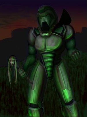
The green shows how our hero who seems to be illuminated by a green light source. I achieved this effect in the following way: create a new layer and set it to "color" of course the layer you create has to be above the others. This order (basic structure: draw shadows first, then highlights) comes up with the most satisfying results.
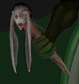
Some refining here and there, especially on the background / flares / reflections / shadows... and THATS IT, i hope this helps you on your way to the perfect illustrator. The only thing which helps is practicing, analyzing mistakes in proportion / detail and learning to avoid them, peace.
Text written by Rasmus Selker for GameArt.com