GameArt Spotlight #82
"Alice: Frolicking in The maze" by Insanity Inc.
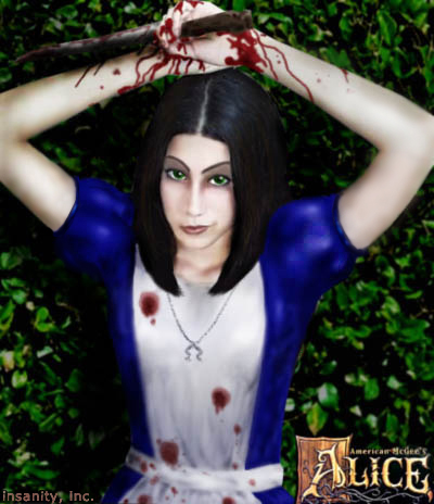
Image details
- Title: Alice: Frolicking in The maze
- Gallery ID: 01041
- Artist name: Insanity Inc.
- Posting date: 2000-11-12 (a Sunday)
- Artist website: http://www.deadlydimensions.com
- Tags: Alice, American, McGee, girls, women, sexy, bloody, knifes, wonderland, fantasy
- Image size: 114.8 KB
- Votes: 30
Please be sure to read the Copyright & Legal information text on the About & Help page.
Spotlight article
Hi. I'll start off with an introduction. My online name is insanity, inc. My real name is John Holland. I used to be a commercial artist for NASA when I was nineteen years old. When I left NASA I never drew again. Recently, nearly twenty-nine years old, a friend of mine who goes by the name of "soul" gave me the inspiration that I needed to draw once again. For that I'm very thankful. :)
And now about the art You may think me crude because my style may be unorthodox because I've just recently started using Photoshop. So, through tinkering with the program- I've discovered different opacities of brush, blur tool, burn tool, dodge tool, and smudge. Yup. That's all I know how to use-- but I'm learning. So, for now, I make do. Another thing I'd like to mention is that I don't usually hang on to many of the prototypes as I progress through the drawing so you will find large gaps in the pics I'm providing. Sorry I didn't know there was gonna be a pop quiz. ;)
I want to state first a suggestion Always start your picture about 10-15% larger than you intend it to be. Once you are all done, you ca size down to where you need it. Why is this? It helps get rid of a lot of small flaws and rough edges that you may have left behind.
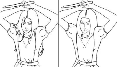
The first pic shows the outline I did of Alice. As you can see the lines are very rough. That doesn't matter to me at all. I'll explain why later. This pic came from an original fast sketch I did on notebook paper. I had used the form from a model of a girl I found on the Internet and no she wasn't holding a knife. I liked the way she was posing She seemed kind of peaceful yet mildly menacing. After sketching from the model, I scanned it in and imported it to Photoshop. I then traced over it on a seperate layer using the mouse. I know that's not the easiest way But like I said, it works for me. As you can see also in this pic her hair is very long and wild looking. I was going to go with this look because that's how I see Alice in my mind and that's why they call it artistic license. I also chose to break away from the very large-eye look that the game presents.
I do very much like the Alice that American McGee has created, but it doesn't suite my style. I like my art to be a little more anatomically correct. So, I made normal human eyes. Also, after viewing other fan-art of Alice... I noticed that none were really playing on the fact that "alice grew up... so did wonderland"... People are drawing her as a 10-12 year old girl. Also an upside down cross seems to be the choice pic of charms to hang about her neck. Screen shots show an Omega symbol. So... as I stated before... artistic license... we are all intitled to it! ;)
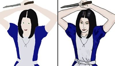
In the second pic you can see that I did choose to compromise and make her hair more like the game Alice. I feel it was a wise choice, thinking that people would better identify with it that way.
Pic three. Ok now the boring tedious part (and perhaps another unorthodox thing). I make a second layer over my line drawing. Next I make it a "multiply" layer. Then I color in the base colors (like a coloring book) keeping everything inside the lines. And using the hide layer option. I toggle back and forth from showing both the colored layer and the outline layer to just the colored layer where I then do a quick burn tool over areas I feel should be shaded. I then delete the line drawing.
And now the big missing gap that I didn't save pics for. :( Here's what I did. Doing a lot of zooming I went in and joined all the areas that the line had separated. Why is this? Because in "real life" there are NO lines around anything. When you look at a person you don't see bold black lines surrounding their entire outline, around their eyes, fingernails, etc. So if you want a tad more realism You should get rid of the lines. Now Once all the gaps have been filled. The fun begins. :)

In pic five I'm providing a close-up of Alice's dress. As you can see, I used a dull gray color for her apron. The reason for this is that it will do better when you run the burn tool over it than plain white. Which brings me to the next step. Using the burn tool, I began carelessly making the creases where her belt chokes around her waist. Then I used the smudge tool and to blend them in better. You'll find you may go back and forth a lot from tool to tool to accomplish what you want. Then I used the dodge tool to highlight, what I felt were, key areas. Then to top it off, I used the blur tool to make it all blend. I did this throughout her whole body. Constantly zooming in on tiny little areas-- burning, blurring, dodging, and smudging. A bit tedious But I enjoy it. The burn and smudge tools are your friend. ;)
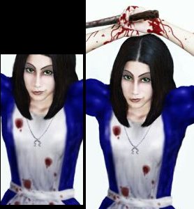
In pic six I added the blood. I must say Blood isn't easy. Keeping in mind one major observation: drawing the blood on her clothes will have to be much different than drawing it on her hands and arms. The reason being is that cloth will absorb blood more because it is more porous than your skin. Blood on your flesh will most likely run off or dry. On cloth it will sink in. So. Using a brush with a low opacity, I chose a medium burgundy color and chose for the brush to have "wet edges." I then proceeded to randomly put a light film of blood puddles all over her apron. Once I got the effect I wanted, I picked a deeper burgundy, raised the opacity, and unselected the "wet edges." I then went over every little spot I made prior and colored in a darker spot in the middle of them and blurred it a bit. This, I hope, produced the effect of blood being absorbed into cloth.
The necklace and charm are very simple. I just chose a medium to light gray and drew over the original black lined one. After that it's a simple matter of zooming in and using the dodge tool and burn tool to produce the beads on her chain and to produce depth to the charm.
Her face was simple burn and doge tooling with a touch of smudge. All the lower lip needed was an inverted arc made by the dodge tool.
In pic 7 I added details to her hair, to the knife, and dripping blood to her hands. The knife was simple and crude. It was all dodge and burn. The hands were from zooming in closely and burning. The hair was from drawing individual strands. In this pic if you look closely you'll see the light brown strands. Then I added some blur to it (I'm burn and blur happy- lol). The blood was very easy. Blood is closer to the consistency of syrup than water. So I made it run in little streams away from larger stains. Added the occasional splatter and then an oozing line down the edge of the knife, and bang done. I'm sure there's a better way to produce blood effects, but this one worked for me.
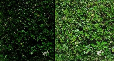
In pic eight you'll see an actual picture of someone's foliage. This I got from a free 3-D texture site. I wanted a touch of "real life" in the picture I also know that there were hedge mazes in Alice in Wonderland. So I chose this texture. Ok I wanted to make it look gloomy, as I noticed the game will be. So I took a very large burn brush and set it to about 50% opacity. I then generously burned the whole texture. Next I went over the whole, now dark, texture and lightly blurred it with a large sized brush. This will help later on to bring Alice more to the foreground.
Next all I had to do was, using the polygonal lasso tool, cut Alice out of her white background and place her over the gloomy foliage. Next, using burn tool on the foliage layer, at about 20% opacity, I darkened the areas around Alice that I felt should be showing her shadow. I then "flattened" both layers into one and cut the excess foliage away to properly end where her arms do. I then, meticulously, went around her whole body and blended her into the background.
The end product was just a matter of shrinking the picture down to the size I wanted to clean up the edges, and placing both the Alice logo and my name in the pic. And that's about it. :) Thanks for reading. I hope this helps.
Text written by Insanity Inc. for GameArt.com

