

GameArt Spotlight #84
"Still Alive ... Somehow" by Yahoohahe
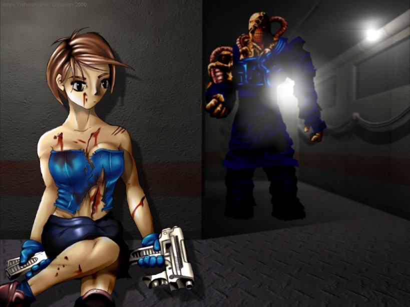
Image details
- Title: Still Alive ... Somehow
- Gallery ID: 01046
- Artist name: Yahoohahe
- Posting date: 2000-11-20 (a Monday)
- Artist website: http://www.yahoohahe.ukgateway.net
- Tags: Resident, Evil, , Resident, Evil, 2, RE, Nemesis, Last, Escape, anime, manga, japanese, girls, sexy, scary, drawings
- Image size: 22.01 KB
- Votes: 26
Please be sure to read the Copyright & Legal information text on the About & Help page.
Spotlight article
Where to start...? Aaahh...... This picture is made up of 3 main parts: Jill, the Nemesis, and the background. I made these 3 parts completely seperately from one another, and by messing around with the layers in PaintShop Pro, I positioned the characters on the backdrop to give the finished thang. There are 69 layers in the final image - 39 for Jill, 22 for Nemesis, and 8 for the final composition; I find that the more layers used, the easier it is.....
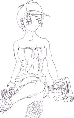
Jill: Starting with a scanned in pencil drawing, I made this the top layer in PaintShop and set the layer blend mode to 'Multiply'. This basically makes the white of the pencil drawing transparent, but keeps the dark lines.
Now it's just a matter of airbrushing in the basic colours using the lines as a guide (It's a very good idea to use a new layer for each colour). I use the smudge brush extensively to get the colour right up to the lines but not overlapping. Here's a pic of what the base colours look like without the pencil lines:
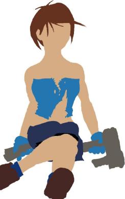
This is an incredibly boring process, so I usually shade a colour as soon as I finish it's base, before moving on to the next. Now the layers start piling up, as the light and dark shades are added to all the different colours. I usually end up with about 4 shading layers for each colour.
If you want to make highlights look shiny, then setting the layer blend mode to Dodge and painting pure white on looks the best. Also, burn and pure black looks good for heavy shadow (make sure to smudge it a bit though!). That's basically it! In fear of sounding patronising, stuff that would go in front in the real world should go in higher layers for the picture (eg. hair would go in a higher layer than the face).
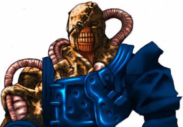
Nemesis: For the Nemesis I used exactly the same procedure as for Jill. I originally intended the Nemesis to be a dominant figure in the image, but he ended up having to be kinda in the background. Here's what he looked like originally:
I had to darken and blur him slightly so that he fitted into the background better. The background, incidently, was made in Lightwave, and given a depth of field so that the corridor softned out a little as it got further away. This is why I had to blur Nemesis a bit, otherwise he looked a bit odd.
Well, that, I think, is it. If you've read this far, then THANKS! To tell the truth, I'm not entirely happy with Jill.... The original drawing wasn't quite right.... Ah, well.... Maybe next time, eh? Yahoohahe ...
Text written by Yahoohahe for GameArt.com