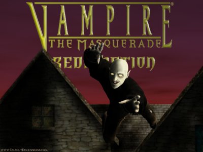
GameArt Spotlight #87
"Bump in the Nigh" by Insanity Inc.
Image details
- Title: Bump in the Nigh
- Gallery ID: 01111
- Artist name: Insanity Inc.
- Posting date: 2001-02-16 (a Friday)
- Artist website: http://www.DeadlyDimensions.com
- Tags: Vampire, The, Masquerade, Redemption, pyramids, horror, egypt, paitings
- Image size: 19.26 KB
- Votes: 32
Please be sure to read the Copyright & Legal information text on the About & Help page.
Spotlight article
My last spotlight was on Alice: Frolicking in the Maze and in it I described in full detail my particular way of doing things. This time I'll touch up on it a little more and perhaps throw in a little helpful info to boot.Ok. Well I used to be a pretty well known Quake 2 mapper back in the day (I used a different name back then though) so some old habits still die hard. Everyone has their own little calling card, or signature so to speak. What I mean by this is not the way you sign your name but a particular thing you do in every piece that is your way of screaming your name. Since I used to be a level designer I got very used to using textures on "brushes" (what they call the polygon you are shaping at the time). I've kind of incorporated this concept into my digital art. As I explained in the Alice picture... I like to fuse a bit of reality into my pictures. With Alice it was the real photo of hedges behind her. With my "Bump in the Night" picture I used real photos of rocks and roof shingles (of course I do alter them a lot before the product is done mind you). I really see no harm in doing this. When I worked at NASA we were trained to beg borrow and steal to get what we needed to complete any of our works-- even use clip-art (ARGH! I refused!!). Anyway... Just like I'd use a real-photo texture to cover a game map's wall... I painstakingly pieced the background together using very small non-seamless pieces and blending them together. The best textures that I could find were unfortunately almost too small to be useful--but I managed.
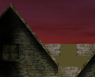
I really had no idea what I was going to do when I started this piece. I knew I was doing some sort of an old style cottage but I really had no clue what I was gonna use it for. After I completed the buildings (the background)I stared at it for about 20 minutes while consequently beating my head on the desk. I thought hmm... Should I do a superhero? Perhaps Zorro (lmao)? A hooded thief in the night? Hmm... "in the night"... That sounds interesting...
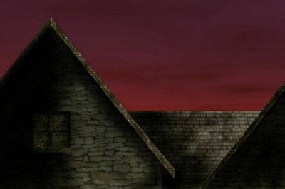
It's been a while since you've done some gameart, I thought to myself. What games out there would fit this dark old style background, fit the theme of "in the night", and still have to do with gaming? Vampire: The Masquerade! That's it! So I immediately began thinking of vampires. What kinda vampire tho? Most the vampires that people do art of are the handsome sort, like from Interview with the Vampire by Anne Rice. I remember the original vampire movie ever made about Nosferatu. This is a class of vampire said to be bald, scaly, pale, unkempt, and having two rat-like adjacent teeth on the upper row. That was the character for my background, I exclaimed!! Hmm... Most my previous works were very static... Portrait like, showing very little motion if any. Drawing the human (or vampire for that matter heh) in motion, a thing called dynamic art, is an arduous task in itself. Not only do you have to be an artist... You have to be an engineer too. The human form is a masterpiece in engineering, so complex and able to move in an infinite number of ways. I am not very experienced with drawing in this manner. I am still studying it. You have to understand that when I was working at the Cape I mostly drew boring and static things like art for the Tomahawk Missile program and what was formerly known as Space Station Freedom ( now Alpha I believe- it was still during the Cold War so everything was about freedom and democracy lol), as well as more pictures of the Orbiter (shuttle) than I'd like to remember-- oh yeah...And some things I was told not to remember -Shhhh.... So at first this is what I had done:
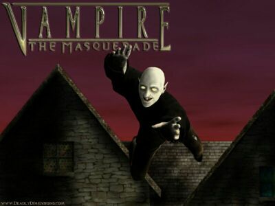
As you can see there were a lot of errors... Even my attempt at the logo for the game was pathetic! So I contacted Maarten Kraaijvange and Yujin Kiem over at Nihilistic Software (www.nihilistic.com), the developers of the game, and they were nice enough to not only critique the art but send me the developer's version of the logo in psd format. Thanks guys! So using Maarten's advice I moved the vampire over to the right more and made it look more like the blood-sucking fiend was jumping off the roof top at you rather than flying at you. This was good advice I feel. So after all was said and done here is the final product.
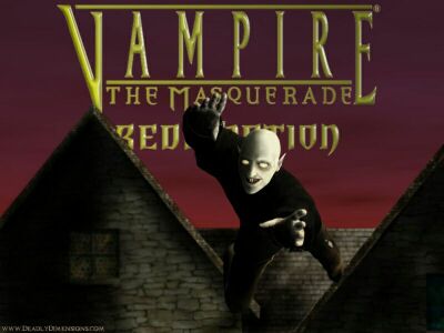
If someone asked me what I would change in this piece if I could do it all over again I'd say "I'd change the sky, making it more fish-bowled rather than straight horizontal, and maybe add more buildings in the background. I'm still learning. I don't consider my self an artist but rather an "art student". Same thing when I was taking martial arts-- I never considered myself a Martial Artist-- That, like art, is something that you will spend your whole life learning... Therefore... I'll probably always be a student in everything I do. I recommend these books to aid you in drawing the human body dynamically:
Drawing Human Anatomy by Giovanni Civardi
Gray's Anatomy
Dynamic Figure Drawing by Burne Hogarth
You can also use a 3-D program called Poser. Yeah I know a lot of you are probably rolling your eyes right now but if you use it simply as a reference or training tool and don't simply rip the models that's ok. Too often do I see preformatted models being posed with no changes done to them and seeing the "artist" marvel over their own work. If you pose the model the way you want your character to be --use it as a reference or trace the outline or whatever you have to do... And that's groovy. This is how you learn and when you are learning... Use whatever you have to.
Thanks for reading and feel free to contact me here if you have any questions.
Text written by Insanity Inc. for GameArt.com


