GameArt Spotlight #94
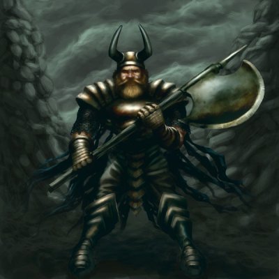
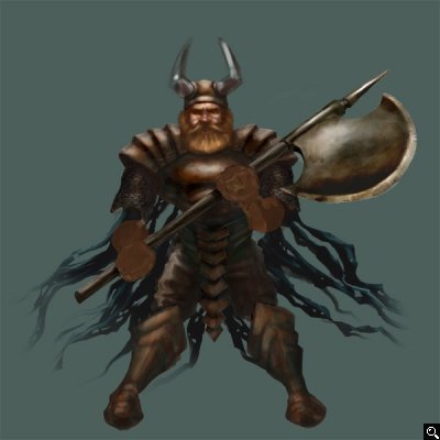
"Dark Dwarf" by Rob Thomas
Image details
- Title: Dark Dwarf
- Gallery ID: 01197
- Artist name: Rob Thomas
- Posting date: 2001-08-05 (a Sunday)
- Artist website: http://www.gameart.com/mindstorm
- Tags: bard''s, tale, legacy, paintings, characters, rpg, adventure
- Image size: 25.17 KB
- Votes: 21
Please be sure to read the Copyright & Legal information text on the About & Help page.
Spotlight article
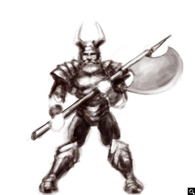
First I sketch the image in Photoshop. This is much easier for me to do now that I have a pen tablet. Before I would sketch on paper then scan it into Photoshop. Either way works great though.
When I am happy with the sketch I adjust the opacity of the sketch layer and change the layer to multiply. I then add a new layer under the sketch layer.
This allows me to see the sketch while applying solid color. Also this method will not affect the color. On the new layer I use the paintbrush at 50% to 100% opacity when applying colors.
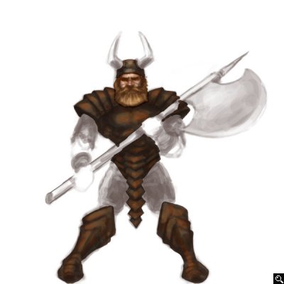
Here I've filled the figure in more and have added more shadow and highlights. I am now using a solid paintbrush at 25%- 50% opacity. A useful thing to do after filling the figure with solid color is to highlight your paint layer and click on the "preserve transparency" box in the layer palette. This alleviates the worries of going outside the lines with you paintbrush and it results in crisp edges.
Here I have fleshed out the rest of the figure and added a color background on a new layer. I noodled with the extra details by zooming in and using a small paintbrush at 25% - 50% opacity. I usually use darker and lighter tones of the same color to achieve a "blended" effect.
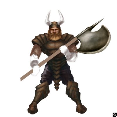
Here I finished up by carefully using the dodge tool set at 35% opacity and set to highlights. Use this tool carefully as overuse of it can look very tacky. Sometimes I avoid the dodge tool and use an almost white color for metallic highlights.
I adjusted the color of the figure a little to blend better with the background. Just for the sake of calling it complete I painted a very loose background. The background was done with darker and lighter hues of the original background color.
Text written by Rob Thomas for GameArt.com


