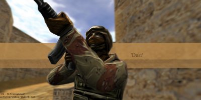
GameArt Spotlight #95
"Dust to de_dust" by R.Trevisanut
Image details
- Title: Dust to de_dust
- Gallery ID: 01196
- Artist name: R.Trevisanut
- Posting date: 2001-07-20 (a Friday)
- Artist website: Unknown
- Tags: Counter-Strike, cs, military, soldiers, terrorists, counter-terrorists, ct, paintings
- Image size: 15.3 KB
- Votes: 33
Please be sure to read the Copyright & Legal information text on the About & Help page.
Spotlight article
I'll say that this piece of art was fairly easy to piece together. It took me maybe an hour and a half... or two. At any rate the production was pretty straightforward.
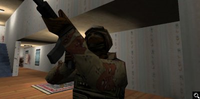
I was looking through my Half-Life screenshot folder searching for something to base a picture on. This screenshot came up of a player looking up the stairs in cs_estate. I thought that the pose was perfect for what I wanted to do.
To start, I had skinned the gsg-9 model in the desert camo a while back. That took me a day and is an entirely different subject. Anyway, after it had been skinned I snapped screenshots of it.
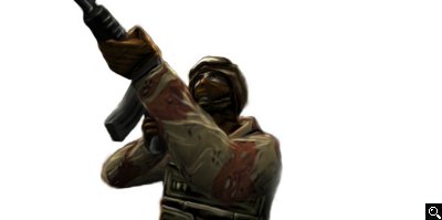
I took the screenshot into Photoshop and cropped it to a size I liked and began to examine it. I based the pose heavily off of the screenshot. In fact I smudged and painted over a good portion of the actual screenshot to get the pose right. After this I took the dodge/burn tool and started adding highlights and shadows to just about everything.
At this point I noticed how weird the player models deform in CS (Which influenced how the final pic was shaping up) and decided some modifications were in order. So, taking the smudge brush and rubber stamp I reshaped his arms, shoulders and hands. You will notice that none of the models in CS have defined wrists and their arms are awfully big ingame.. this looked ugly. I corrected it.
I fiddled with the background and decided that it didn't look right to have this guy decked out in desert camo in the middle of a house in the suburbs. I removed the background, he looked good on white, I thought. However, he was so dark that a lot of the detail was lost with the white being brighter than the figure. So, I brightened him up substantially. Easy.
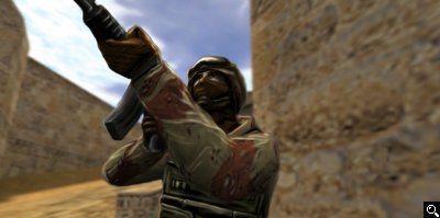
After this, I decided to put in a background. Dust was the level of choice, and luckily I had a screenshot of it on hand. Putting that behind him, I blurred it and faded it some to make the CT more prominent on the foreground.
I added the colored bars and text after that. It was fun all in all, and I plan to do more based on other mods and games.
Text written by R.Trevisanut for GameArt.com


