

GameArt Spotlight #99
"Strider Hiryu" by Mike Monroe

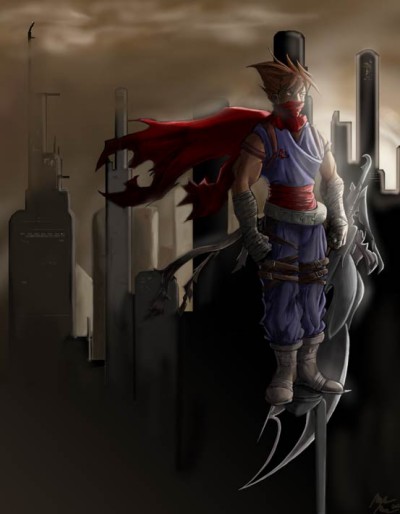
Image details
- Title: Strider Hiryu
- Gallery ID: 01270
- Artist name: Mike Monroe
- Posting date: 2002-05-26 (a Sunday)
- Artist website: http://darkvvulf.piratecove.org
- Tags: strider, classics, playstation, amiga, old, consoles, amiga, comics, manga, anime, drawings
- Image size: 31.81 KB
- Votes: 20
Please be sure to read the Copyright & Legal information text on the About & Help page.
Spotlight article
This are my thoughts. They're hardly law as I'm not the best artist in the world, but I throw them here in the event someone may make use of them.
Alright. Everything begins with a sketch (it doesn't need to of course, but it helps). Scan in your sketch fairly big, and with your composition in mind crop the document accordingly. For this piece my document ended up at 4427x5676 pixels @ 600 dpi- so a decent computer helps out significantly of course.
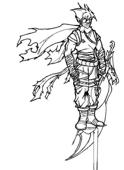
Mistake No #1: My outlines are too thick. If thick outlines are your thing and intention then carry on, however they weren't mine. So I'll have the extra effort of trying to cover them up/paint over them. Thin outlines help, don't worry about making sure the scan picks up every little detail you took the effort to draw- you can always paint that back in later.
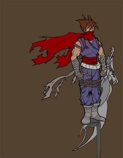
So I make a new layer, set it to Multiply, and choose a color to fill it with. Some artists consider just using the Fill tool a no-no and that manually painting in the color will make your background a lot more diverse. I tend to agree, but this time I'm a lazy SOB. Anyways, after that's done I lay the base colors on the figure using the same layer.
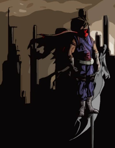
Things become more interesting now. I flatten all my layers and start laying in the shadows and lighting along with the background, painting over the outlines as much as I can. I'm still using a brush set to Normal and just manually picking out darker/lighter colors (It's just the way I work sometimes). When I pick a darker/lighter color to use I try adding a slight tint of another color to it, because no object is just one color with light and dark on it. In this stage set your lighting just like you want it so all you need to do from here on really is just to add detail, this will save some headaches and repainting later on.
Mistake No #2: I basically tried to guess the lighting here. This isn't really a huge mistake if you have an idea of what you're looking for- I think I kinda pulled it off- but one should always try to use reference for light. Clothes, people, whatever (I recommend trying Poser for figure lighting).
One thing I really want to emphasize is lighting. Study it, learn it, obey it. Don't be afraid to shade something to near black, or brighten something to near white. A thing I notice a lot is that people will shade to show form but little else (i.e. like there is a light perfectly place everywhere to emphasize each and every little fold and crease). Study how other painters work with their lighting.
Now I grab the Paint-Brush tool, set it to Hard Light and about 20% opacity (or less) and dig in- adding more form and detail while also enhancing the light and shadows. I'm making constant use of the Eye-Dropper tool (hold Alt) to grab darker or brighter colors and still mixing in some tints. I also tend use the Airbrush tool because it can handle shading a little smoother (i.e. the clouds).
Hours later...
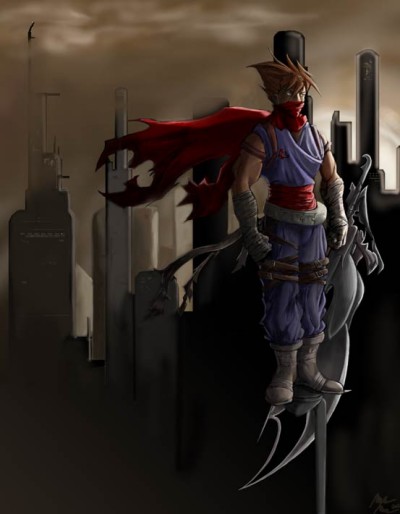
I feel almost done, but decide to add a shimmer. Basically just created a new layer and softly added some blurry white in some areas. It's easier to just leave it on the new layer so you can still tweak the picture without having to worry about fixing the glow later.
At this point I'm at where it feels like you can keep poking the picture as much as you want but it's not going to change much. So I wind down and wrap it up.
Text written by Mike Monroe for GameArt.com