

GameArt Spotlight #70
"Koz" by Milano J.

Image details
- Title: Koz
- Gallery ID: 00938
- Artist name: Milano J.
- Posting date: 2000-07-11 (a Tuesday)
- Artist website: Unknown
- Tags: quake3, arena, quake, 3, arena, quake3:arena, flags, caprture, the, flag, ctf
- Image size: 195.58 KB
- Votes: 19
Please be sure to read the Copyright & Legal information text on the About & Help page.
Spotlight article
Let's make this quick (as the image took 2 and a half hours in a period of 2 days). As you can see, the picture is kinda messy. I start with a sketch on paper with any pencil, then scan it in. I *could* ink it, I have the tools and what not, but since I use a mouse to color, the sketches can help define shaded areas therefore making the 'shadowing'process a little easier.
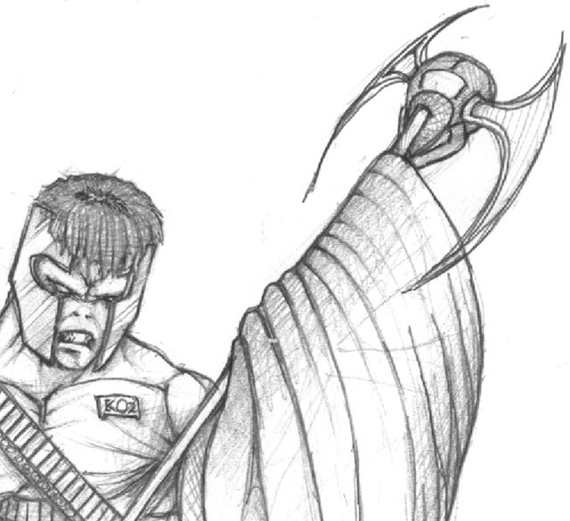
I use the sketch itself as the background layer in Adobe, no transparency or anything. Then I add a 'flats' layer(set to multiply), I will zoom in some and paint on the sketch with basic colors (using mouse, or I will use the good ol' lasso and select areas off and fill em). A tan color for his skin, medium blue for the flag, ect. For the hair, I made a seperate layer of lines (line tool in Photoshop) using brown and a lighter brown, I quickly ran them outwards from the top of his head (I made sure to leave some background showing in between some lines to add a depth after the highlights on the hair was complete.) His abs and helmet were selected with the lasso, put on their own seperate layer, and I used the gradient tool (the radial one) with yellow fading to black on the abs, and the side-motion gradient for the helmet. For the skull thingie on the end of the flag, I selected it with the lasso, and then used a gradient which had an appeal of reflective metal (blue/orange/greyish/white turned out good after some expirementing) and then applied that to the skull.
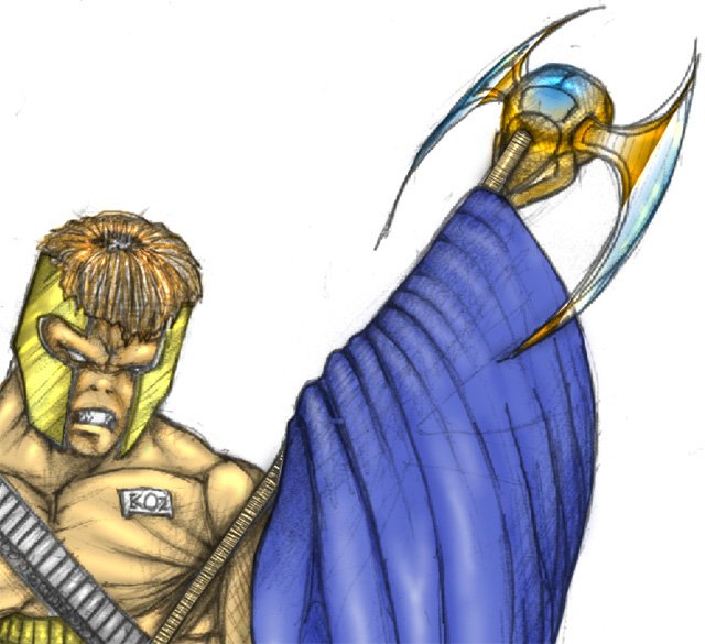
This is the fun part. After the flat layers are completed, I add a layer on top called shadows, this layer is set to 'multiply' and I select darker shades of the original flat color and mouse away at it. Keeping in mind ofcourse, the source of incoming light and all that jazz (this had no light source when I was making it, no background yet!) I added the background last. So, we basically go around all the edges and paint in softly with brushes (darker colors, very low opacity, sizes vary). That's about it for shading.. It's also good to touch up the shading layer while you are working and/or completed with highlights layer. I didn't do much touching up.
Ok so now to the highlights, let's start with the flag. The skull on the end was intended to have a metal look to it, so I made a new layer 'color dodge' and painted the skull with a light light blue and very very low opacity brush(this process will 'shine' up anything on the layer below that you paint over). The same process was done for the abs and helmet. For the flag itself, I highlighted with a 'screen' layer and a white/low opacity brush, I would run streaks down the waves in the flag to add depth, adding more white to the 'higher' areas, and shading to the 'deeper' areas. The skin itself was highlighted with a mixture of colore dodging and screening(again, with a very low opacity brush) Not much to it. The crosshatching that was on the sketch layer helped alot with his skin texture and depth/shading. The flag pole I used a little trick, I selected the pole with my lasso, made a new layer, filled that selection a light brown - I kept the selection and then went to my channels, created a new channel and filled the selection white. Then, keeping the selection in the channels window, I did a filter-->gaussian blur. I added some noise (Filter-->add noise) and motion blurred it on a 45 degree angle slightly. Keeping the selection I went to my brown layer of the stick in my layers window, filter-->render-->lighting effects and used that channel I made as a texture channel.. Therefore giving it that wood look with embossed ridges in the handle. (Seems like a lengthy process but it really isn't). The logo on the flag was taken from a Quake3 screenshot in a game of capture the flag, I then loaded the screenshot in adobe, lasso'd out the flag, rotated it to the angle I wanted, then cut it to my clipboard and pasted it in my image with the 'screen' layer, and another layer on top of it for shadows. Props to ID software:). The hair was easy, I used a 'color dodge' layer and just highlighted in a ring on top of his head, emphasizing the ridges. Seeing as the image was close to completion, I quickly adjusted brighness/contrast for all the layers to blend in everything nicely.
The background was a screenshot I took in Quake3 and modified in photoshop.
That's it!
Text written by Milano J. for GameArt.com